
Colour is so important in our life. It is a form of nonverbal communication that can affect our moods and emotions. That is why it’s crucial to create a perfect colour scheme for your interior that adds style, mood and overall comfort level to the space.
Colour combinations can be hard to crack when you don’t have the right knowledge. PG courses in interior design can help you learn colour theory for interior design and understand how to pair different colours.
Mistakes can be avoided if informed and guided ahead. Get your colour scheme right by avoiding these three biggest mistakes while designing your interior or learn how to correct them, so you don’t end up creating a space that is a colour combination nightmare.
Adding a dominant colour in a space is great but when you put together more than one dominant colour it can create problems.
The first problem here is saturation. When decorating a room, you want to vary the level of saturation in the colours to make the space feel more balanced. But when there are only two dominant colours covering the whole space in the same level of saturation, the colour just gets too strong and too harsh and there is no bridge, which is the second problem.
When there are two dominant colours, you need neutrals to bridge those two dominant colours and make the space more cohesive. The best way to do that is by adding patterns. Every space needs some kind of break in the texture or the pattern to make it feel balanced. So, there shouldn’t be two heavy colours fighting for attention but let one colour dominate the other to make the space feel more relaxed and balanced.
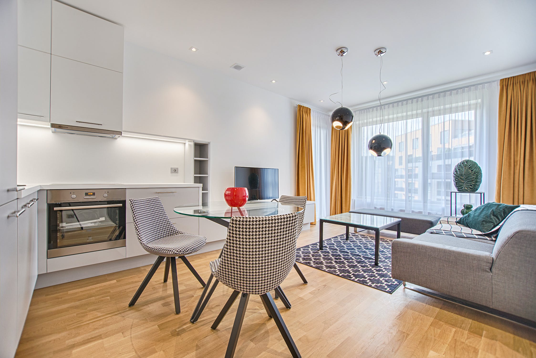
The truth is neutral tone interior design and style are fabulous when done right. But it is really hard to achieve and one can easily get it wrong. As a result, making the room looks boring.
There are two important points to keep in mind when going for a neutral tone; variation and texture. White paint comes in a hundred different hues. When selecting your neutrals, you don’t want to go too far and have everything in the room become too “matchy-matchy.” When there are too many similar colours you can run the risk of making the room boring to the eye. Instead, try to create a variation in those neutrals to make the room interesting and dynamic.
Texture is a huge thing in colour combination and you’ll see that most successful neutral spaces have a lot of texture. Texture helps bring out depth and interest to a neutral space.
The majority of people tend to play safe when picking a neutral colour scheme. When you try to blend everything together, none of the design elements is going to stand out. This can make the space look bland and uninteresting. Fortunately, this mistake can be fixed.
The best trick is to incorporate different visual and tactile textures to create interest. So, it is adding heavier textures to add some balance and visual weight to a neutral colour scheme. This will also make the space feel more grounded and intimate. You can also add delicate textures such as decorative pendant lamps or artwork to add an airy and elegant feel to the space.
Another way to add more visual interest to neutral colour schemes is by adding some contrast. Add eye-catching accent colour using decors and accessories or add a bold pattern or print into the mix.
One of the biggest colour combination mistakes that people make is using too many colours and contrasts. As a result, the room gets an unbalanced array of colours, making the space uncomfortable for onlookers. That is why many professionals advise using limited colours and experimenting with different shades of the same colour family for getting more dramatic and exciting effects.
Planning out interior designs can get easier when you understand the principles of balance and apply them to your design. It guides you to make a space look visually stable by using the right colour scheme and properly placing accessories, furniture and other elements. Without incorporating balance in your design the space can end up looking odd and uncomfortable. So, when there are too many colours, it becomes hard to harmonise them.
While there is no limit or rule as to how many colours should be used in one room. Using too many colours can make the space either too overstimulating or boring. The key is to find proper balance when working with multiple colours.
If you are nervous about getting your colour combinations wrong, start small. Choose one colour and go from that. Then work through your idea by choosing a second colour that works well with the first colour. Repeat this step until you have enough colours you need to bring your idea to life. Remember that it’s fine if your colour combination doesn’t work out the first time. This way you can learn what doesn’t work and what does.
When you get the colour scheme of the interior right, the rest of the design process can go on smoothly. The above-mentioned common mistakes are to guide you in your interior designing projects and help you avoid the same mistakes when choosing colour combinations for a space. By carefully analyzing your colour choices and considering these tips you should be able to create beautiful spaces without any issues.
If you love organizing furniture and designing rooms and want to learn about colours, fabrics, and spatial layouts, you can try interior designing courses at JD Institute Of Fashion Technology. These courses are designed to provide students with both the theoretical and practical expertise required to work as an interior designer.
Through PG courses in interior designing you can learn colour schemes, how to have better control over the designs through proper colour choice, and many other things relating to interior designing. Visit JD Institute to apply for the course and start your exciting career.
Copyright © 2025 JD Institute of Fashion. All Right Reserved
Designed by


