
“Perfection is the enemy of progress.”
That’s not just a quote from Winston Churchill—it’s a whole mood in today’s design world. The rise of Deconstructive Design is a sign that people are tired of overly polished visuals that feel soulless. Now, it’s all about the raw, the rebellious, and the real.
This new wave of design is changing everything—how we create, how we consume, and most importantly, how we learn. And for young creatives studying at spaces like JD Institute, this shift is more than a trend, it’s a toolbox for the future.
Grunge is no longer a ‘90s thing—it’s a now thing. It’s showing up in album art, fashion editorials, and web design. Rough textures, pixelated overlays, and rebellious fonts are making a comeback.
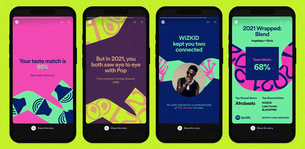
Take Spotify’s Wrapped campaigns, they feature loud colors, distorted typefaces, and edgy, overstimulating designs. It’s messy, but it connects.
Grunge design reminds future designers that beauty doesn’t always mean clean—it can be expressive, loud, and full of flaws. It’s a lesson in creating impact over perfection.
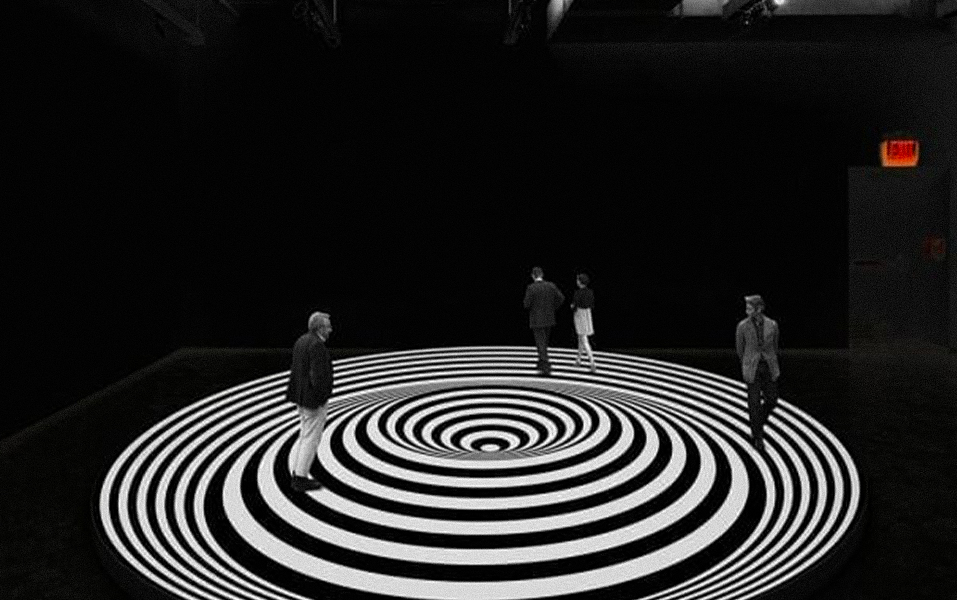
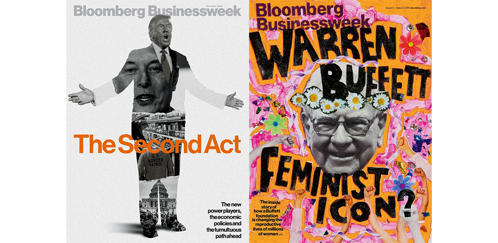
Brutalism in digital design is about rejecting the sleek and embracing the raw. You’ve probably seen websites that look like they were coded in the early 2000s—intentionally. Harsh contrasts, bare-bones layouts, and clashing typography.
Example? Bloomberg Businessweek’s shocking covers and the weirdly functional Craigslist website—they stand out because they dare to look different.
At JD Institute, students in interior design learn how to break rules intelligently. It’s not about looking bad—it’s about designing with intention, even when it looks chaotic.
Ever seen a poster that looks like it’s still being edited? That’s the unfinished aesthetic. Visible guidelines, hand-drawn elements, crossed-out text—it’s all intentional.
A great example? Balenciaga’s campaign featuring glitchy, AI-generated Paris backgrounds and sneakers with ‘Poor Aesthetic’ that looked like loading errors. These visuals make viewers stop, think, and feel something.
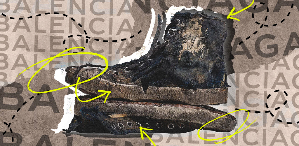
Unfinished doesn’t mean lazy—it means open-ended. And this invites interpretation, especially in fashion and art, where personal meaning drives value.
Tired of seeing the same clean, minimalist branding everywhere? So are most consumers. That’s why many modern brands are leaning into anti-corporate visuals—raw edits, clashing styles, spelling mistakes—on purpose.
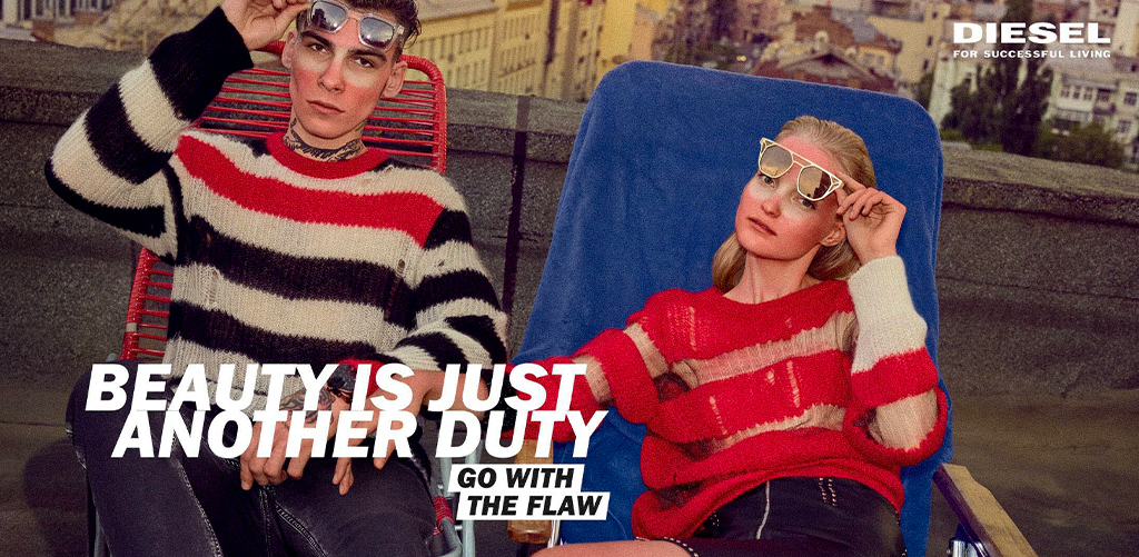
Think Diesel’s “Go With the Flaw” campaign, where models wore clothes with sewing errors and the ads looked like print shop rejects. It felt human. It felt honest.
This style teaches future designers to stop designing to please and start designing to provoke. Because standing out > fitting in.
What started as punk zines and indie flyers is now front-row at fashion week. The DIY aesthetic is about tape marks, collage cuts, handwritten notes, and all things handmade. It celebrates the personal, the imperfect, the real.
Take Frank Ocean’s Boys Don’t Cry zine or Tyler, The Creator’s IGOR visual identity—both look like they were made in a basement with a printer and a Sharpie. And that’s exactly why they work.

JD Institute’s fashion design course encourage students to get their hands dirty—literally. From screen-printed textiles to collage-based communication pieces, students learn that real impact often begins with raw ideas.
The future of design won’t be neat. It’ll be bold, broken, unfinished—and unforgettable. If you’re a young creator looking to stand out, you need to learn more than aesthetics. You need to learn attitude.
And the best place to do that? A place that teaches you how to break the rules with purpose. JD Institute is that place. A creative rebellion.
Copyright © 2025 JD Institute of Fashion. All Right Reserved
Designed by


