
Your brain takes only 13 milliseconds to decide if you like an image. That’s faster than a blink, and it’s exactly why YouTube thumbnails are so powerful. Before you even press play, that small image has already convinced you to click. This is the secret behind why every YouTube thumbnail is designed to get your click, and they are not just random screenshots. They’re carefully designed visuals that mix psychology, color, and storytelling to pull you in.
If you’re learning communication design, like in the JD Institute’s Communication Design course, you’ll quickly see how much strategy goes into these tiny images, and how those skills can be used in any creative career.
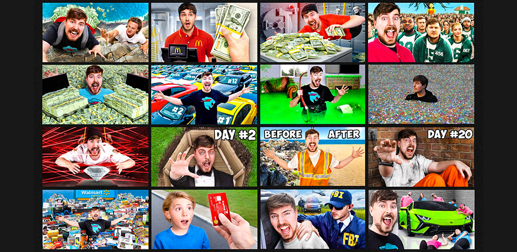
Ever noticed that big YouTubers like MrBeast use bright yellow, red, and blue in their thumbnails? These colors pop against YouTube’s background and make you stop scrolling.
Tools like Canva make it easy for creators to design such colorful, eye-catching images. But there’s more to it, colors have emotions. Red shows urgency, yellow is fun and energetic, blue feels trustworthy.
Aspiring communication designers should study how color psychology works. If you know which colors trigger emotions, you can design thumbnails that instantly stand out.
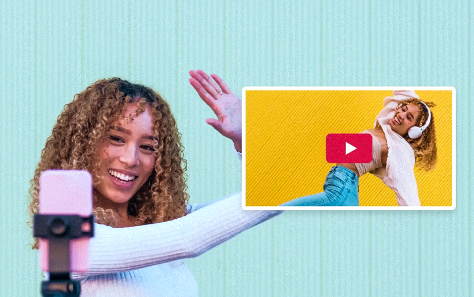
Why are so many thumbnails close-ups of faces showing big emotions? Because humans naturally connect with faces, especially when the expression is surprising, happy, or dramatic.
Look at Emma Chamberlain’s thumbnails. Her expressions feel casual and real, but they’re framed in a way that makes you curious about her videos.
Communication Design students can learn how to plan and capture images that feel natural yet make people want to click, a skill taught in courses like those at JD Institute.
One of the best ways to make someone click is to give them a hint but not the full story. This is called the “curiosity gap.”
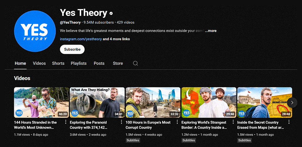
For example, Yes Theory uses bold text and dramatic visuals but never gives away the full detail in the thumbnail. It makes viewers wonder, “What’s going on here?”, and then they click to find out.
Students can practice creating thumbnails that balance mystery with information, so people feel like they have to watch to get the answer.
Thumbnails don’t have space for long sentences. You only get a couple of seconds to make someone read your text, so it has to be short, bold, and clear, even on a phone.
Tech YouTuber Marques Brownlee (MKBHD) uses only a few words in big, high-contrast fonts. It’s simple, but it works.
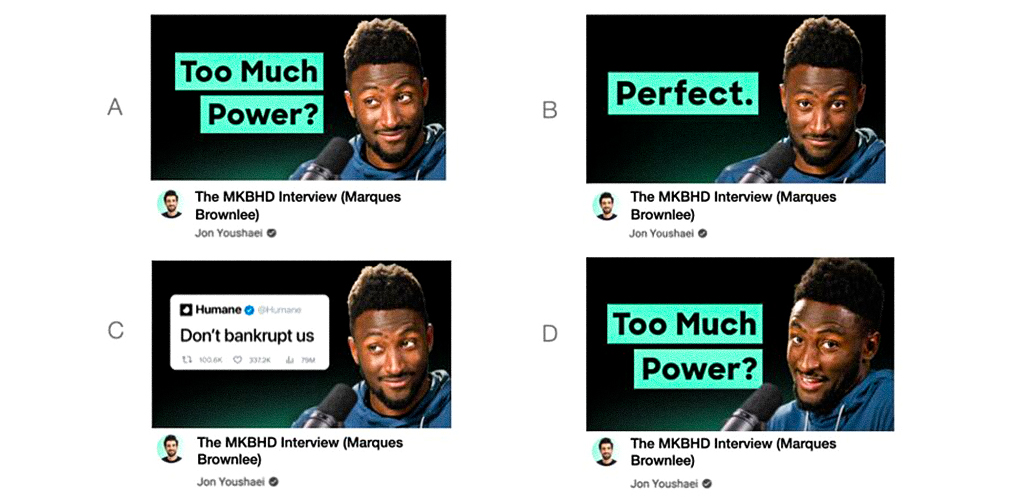
Future communication designers should know how to use typography effectively so that even tiny text grabs attention.
Have you ever spotted a video and instantly known who made it before reading the name? That’s because of consistent design.
NikkieTutorials keeps the same lighting, framing, and colors in all her thumbnails so they’re instantly recognizable.
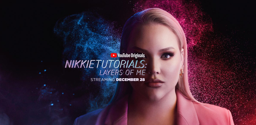
Consistency creates trust. For students, this means learning how to build a style that people remember, and then sticking to it.
Every YouTube thumbnail is in a competition for your attention, and only the smartest designs win. If you want to create visuals that not only look good but actually work, learning from industry experts is the smartest move. That’s why so many creative minds choose JD Institute, where design isn’t just about art, it’s about understanding what makes people stop, look, and click.
Copyright © 2025 JD Institute of Fashion. All Right Reserved
Designed by


