

“If color were a language, fashion would be poetry.”
Ever walked past someone and felt captivated—without them saying a word? Chances are, it was their outfit’s color doing the talking. In fashion, color is more than a visual element; it’s an emotional tool, a storytelling device, and a strategic choice that can elevate a collection from good to unforgettable.
From high-end runways to streetwear revolutions, understanding the science of colors is key to creating impact in the world of fashion. Let’s break down how color theory, psychology, and palette play come together to shape the style stories we love.
Before designers sketch, they plan their colors. Color theory offers the guidelines to combine hues in ways that feel pleasing, striking, or even disruptive—depending on the intent.
The color wheel is central here. Designers experiment with:
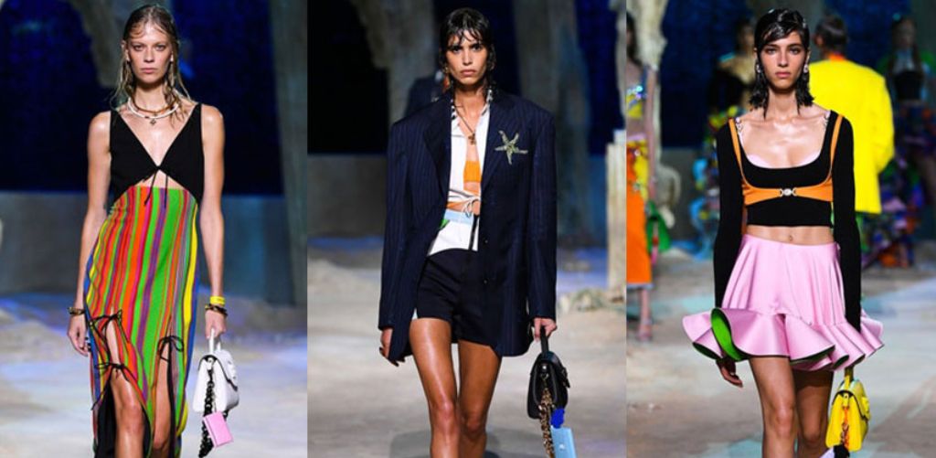
Famous Example: Versace’s 2021 runway was a masterclass in triadic play—bright reds, bold yellows, and rich blues danced together in perfect balance.
Color can influence how a collection feels and how it’s perceived. Color psychology studies how hues trigger emotions and behaviors. Designers use this to build emotional narratives.
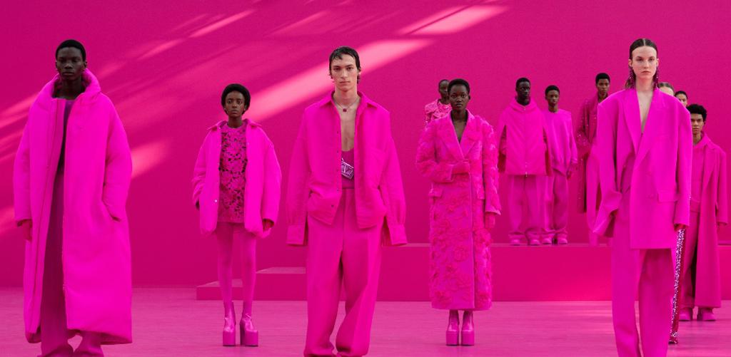
Famous Example: Valentino’s head-to-toe pink 2022 collection was more than bold—it was a celebration of optimism post-pandemic.
At the JD Institute of Fashion Technology, students are taught how to pair psychological principles with trend forecasting to create collections that connect deeply with the audience.
Color palettes aren’t random—they’re thematic. Designers curate mood boards that reflect their vision, pulling colors from nature, architecture, culture, and art.
Key considerations:
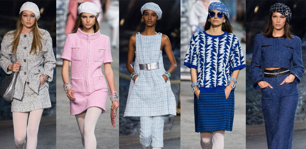
Famous Example: Chanel’s Cruise Collection often features sea-inspired hues—think turquoise, sandy beige, and deep navy—perfectly capturing the travel mood.
JD Institute equips students with the knowledge to build mood boards and palettes in their Fashion Design course that align with both creative instinct and commercial success.
Designers often embrace monochrome to focus attention on silhouette, cut, and texture. One-color collections offer subtlety with sophistication that has benefits as:
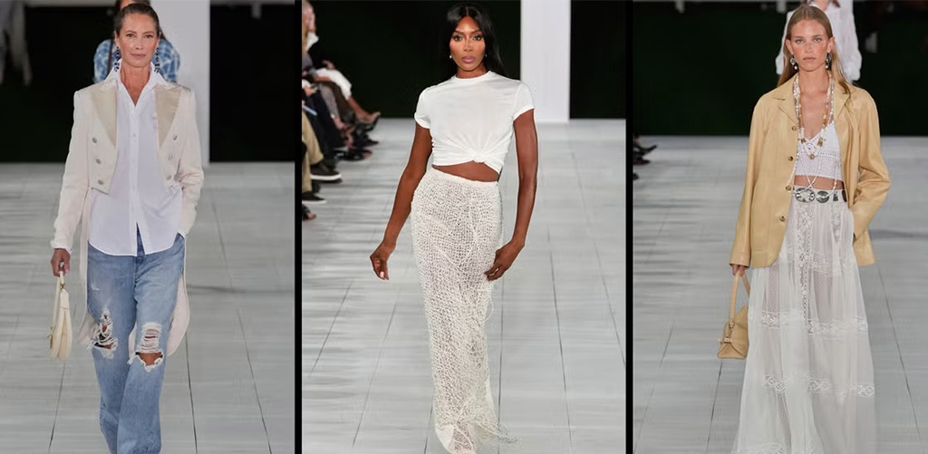
Famous Example: The iconic all-white looks from Ralph Lauren Spring 2020 were ethereal and elegant—pure monochrome magic.
Colors can shape how we perceive bodies. Strategic placement of light and dark shades can lengthen, slim, highlight, or soften body contours.
Key techniques include:
Famous Example: Stella McCartney’s illusion dresses used panels to flatter every shape—without changing the garment’s size.

Color carries deep cultural meaning. Successful designers honor these while crafting global appeal.
Examples:
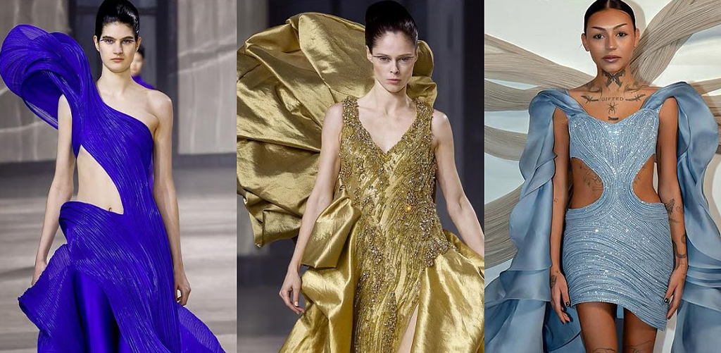
Famous Example: Gaurav Gupta’s use of gold and sapphire blue in couture celebrates both Indian tradition and futuristic silhouettes.
Fashion Design students at JD Institute learn to research and respect these cultural elements while working on global-themed projects.
Color isn’t just an artistic tool—it’s a commercial strategy. Studies show that 85% of consumers cite color as the main reason for buying a product.
Retail benefits:
Aspiring Fashion Designers at JD Institute are trained on how to blend creativity with market psychology, making sure they get the best of it.
Designing with color isn’t guesswork—it’s intention, emotion, and strategy wrapped into one. Whether it’s the calm of blue, the energy of orange, or the luxury of gold—every hue has the power to make fashion unforgettable.
At JD Institute of Fashion Technology, students don’t just learn to design—they learn to think in color. With expert mentorship, hands-on learning, and exposure to cultural as well as global Fashion Design practices, it’s the perfect launchpad for anyone ready to color the world their way.
So what’s your shade of impact? Maybe it’s time to turn your fashion dreams into color-coded reality.
Copyright © 2025 JD Institute of Fashion. All Right Reserved
Designed by


