
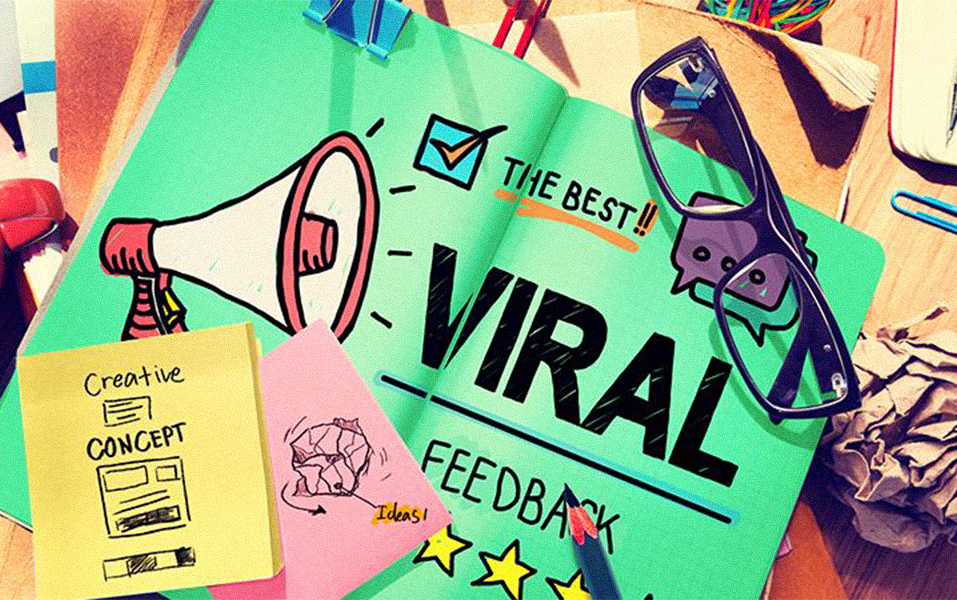
Ever found yourself singing an ad jingle while doing the dishes?
Or randomly craving a burger just because you saw a bright red poster on the road? That’s not just coincidence — it’s smart design and psychology in action.
Ads that go viral aren’t lucky. They’re made to catch attention, trigger emotion, and stay in your head. That’s why if you’re planning to be a communication designer, you need to know how colors, visual cues, and fonts affect people’s minds. It’s not just about making things look good — it’s about making people feel something.
At JD Institute, the Communication Design course teaches these things from the ground up — so they can create designs that don’t just look great but also work.
In advertising, first looks matter — a lot. Your brain reacts to images faster than it does to words. So if a design doesn’t catch someone’s eye in the first 3 seconds, they scroll past it.
Example: Spotify Wrapped.
Every year, people go crazy sharing their listening stats. Why? Because the bold colors, playful graphics, and moving visuals grab attention and feel personal.
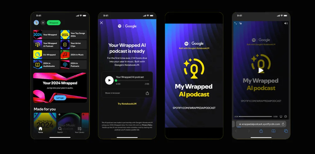
As a communication designer, you need to learn how to use space, icons, contrast, and animations in a way that hooks viewers at first glance.
Ever wondered why food apps mostly use red or orange?
That’s because those colors make you feel hungry or excited. Blue, on the other hand, makes you feel calm and safe — that’s why banks and tech apps use it.
Example: Coca-Cola vs. Facebook.
Coca-Cola uses red to create excitement. Facebook sticks to blue for a feeling of trust. Both are simple choices — but backed by years of consumer psychology.
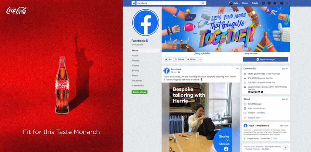
In the design world, picking the right color can change how a brand feels. That’s why JD Institute’s Communication Design course dive deep into color psychology — to learn how emotions and colors work together.
Fonts can feel formal, fun, serious, or stylish — and people react to them emotionally, even without realizing it.
Example: Netflix vs. Innocent Drinks.
Netflix uses strong, bold fonts to create a dramatic, serious mood. Innocent Drinks, a smoothie brand, uses soft, rounded fonts to feel friendly and light.
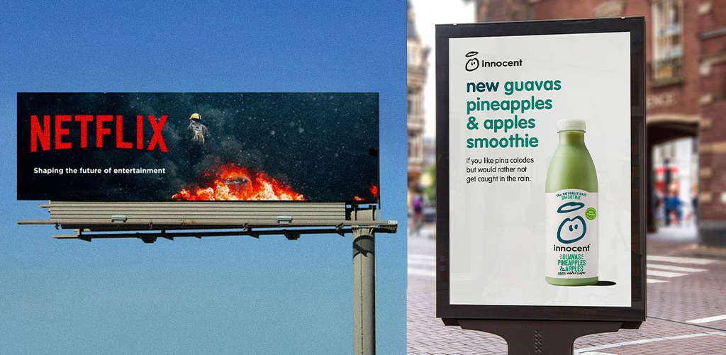
As a designer, you need to know which font fits the brand’s voice. You don’t want a kids’ toy ad looking like a horror movie poster, right?
People connect with people. If a design shows a human face or expression, we’re more likely to stop and look. That’s why ads that include happy or emotional faces often perform better.
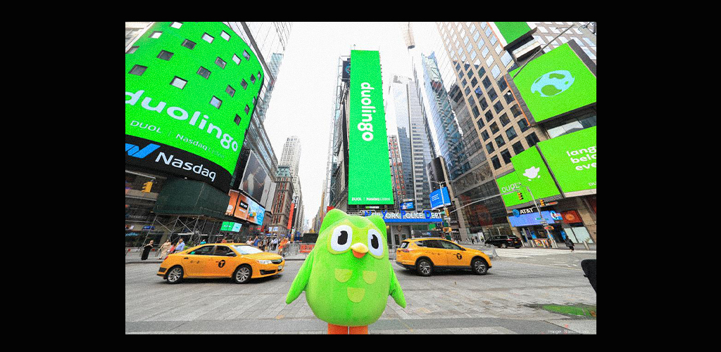
Example: Duolingo’s TikToks.
Their green owl mascot is now a meme! It’s not just the character — it’s the funny expressions, body language, and emotions added to the design that makes it share-worthy.
Designers need to understand what makes people laugh, relate, or feel something. Viral content isn’t just clever — it connects.
Design is not only about creativity. It’s also about knowing how the human mind works.
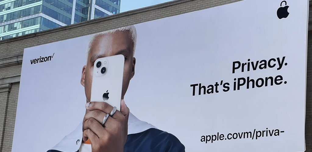
Example: Apple’s Clean Look.
Apple ads and stores are simple, sober, and clean. That’s not by accident — it’s made to feel premium and clutter-free. They’ve studied what makes people trust a product.
The best communication designers blend design skills with psychological understanding. They don’t just design — they influence. And at a place like JD Institute, the Communication Design course teaches you both sides of the coin — the creative and the strategic.
Design is not just decoration — it’s communication. Whether it’s a billboard, an Instagram post, or a product ad, your design has the power to change minds, influence choices, and maybe even go viral. So if you’re someone who wants to go beyond aesthetics and truly understand how to create ads that work — JD Institute is your launchpad.
Copyright © 2025 JD Institute of Fashion. All Right Reserved
Designed by


