
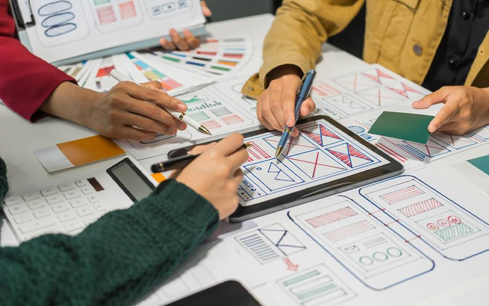
We usually think layout is just about arranging stuff nicely. But it’s way more than that. Whether it’s a book, a mobile app, a newspaper, or a poster on a street wall, layout design decides what grabs your attention, what you skip, and what you remember.
So, what is layout design, and why does it matter in everything? Let’s break it down with simple examples and real-world lessons, especially for students dreaming of a career in design or media.
And if you’re one of them, you’ll love how the Communication Design course at JD Institute makes layout design feel as easy as snapping puzzle pieces together.
Ever noticed how some books feel effortless to read while others feel too crowded or boring? That’s because of layout, the way text, headings, and images are arranged on a page.
Take Penguin Books for example. Their classic layouts use the right font size, clean margins, and breathing space so your eyes don’t get tired. Even their chapter breaks are designed to give your brain a little rest.
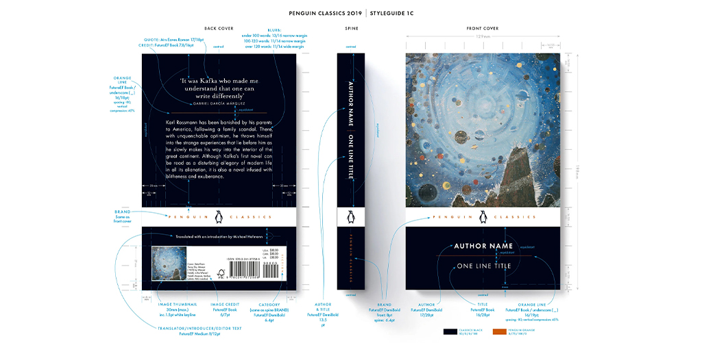
What to learn from this? Good layout isn’t just for looks, it also helps people enjoy reading. Students should understand how white space, alignment, and font choice make a big difference. You’ll find all this taught in the JD Institute’s Communication Design course, where design starts with thinking like a reader.
No one reads every line in a newspaper, and they’re not supposed to. That’s what makes a good newspaper layout so clever
Look at The Times of India or The New York Times. Their pages use grids, headlines, boxes, and photos to guide your eye exactly where it should go.
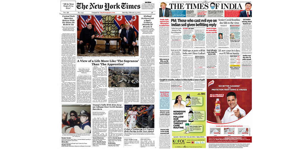
What to learn from this? Designers don’t just place things, rather direct your focus. Knowing where to put headlines, quotes, and images is key to making a layout work. This skill comes naturally when students are trained to think critically.
Ever opened an app and instantly felt like you knew how to use it? That’s smart layout again.
Apps like Spotify, Zomato, and Duolingo use layouts that are clean, simple, and user-friendly. The buttons are right where you expect them to be. The content is spaced out well. The design makes you want to keep using it.
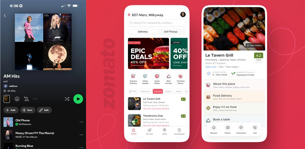
What to learn from this? A good layout in apps can turn users into loyal fans. That’s why layout design is so important in UX (User Experience). Students of communication design need to learn how layout affects how people move and interact online.
Ever been walking by and a poster made you stop in your tracks? Maybe it was a new movie, a fashion ad, or even a social campaign.
Take Apple ads or Netflix posters that have bold titles, clean design, strong visuals. That’s smart layout at work.
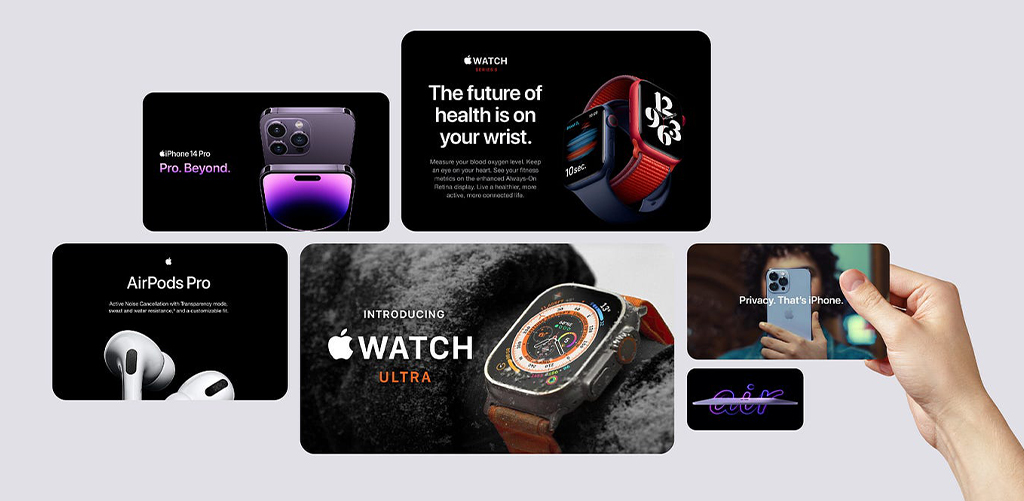
What to learn from this? A good layout makes a message stick. Designers should learn how to use contrast, space, and image placement to create impact, all of which must be taught through hands-on exercises to let the students gain practical exposure along with theoretical.
Here’s your sign.
The Communication Design course at JD Institute helps students turn their natural creativity into powerful design skills. From learning how to layout a magazine page to creating a user-friendly app screen, it’s all part of the journey.
Design isn’t about making things look good. It’s about making them work well, and layout design is at the heart of that.
Copyright © 2025 JD Institute of Fashion. All Right Reserved
Designed by


