
Ever tried reading yellow text on a white background? That’s what happens when contrast goes missing, it’s like watching a movie with the brightness turned down.
But when used right? Contrast can make everything pop, your designs, your outfits, even your Instagram feed. From Billie Eilish’s neon green hair to Apple’s classic black-and-white ads, contrast isn’t just a design element, it’s a strategy.
Let’s break down why contrast in design is your best friend, and how top fashion icons, interior stylists, and branding experts use it to create visuals that can’t be ignored.
Whether you’re designing a logo or styling a streetwear look, contrast creates instant attention. It separates the foreground from the background, the important from the decorative, and the message from the noise.
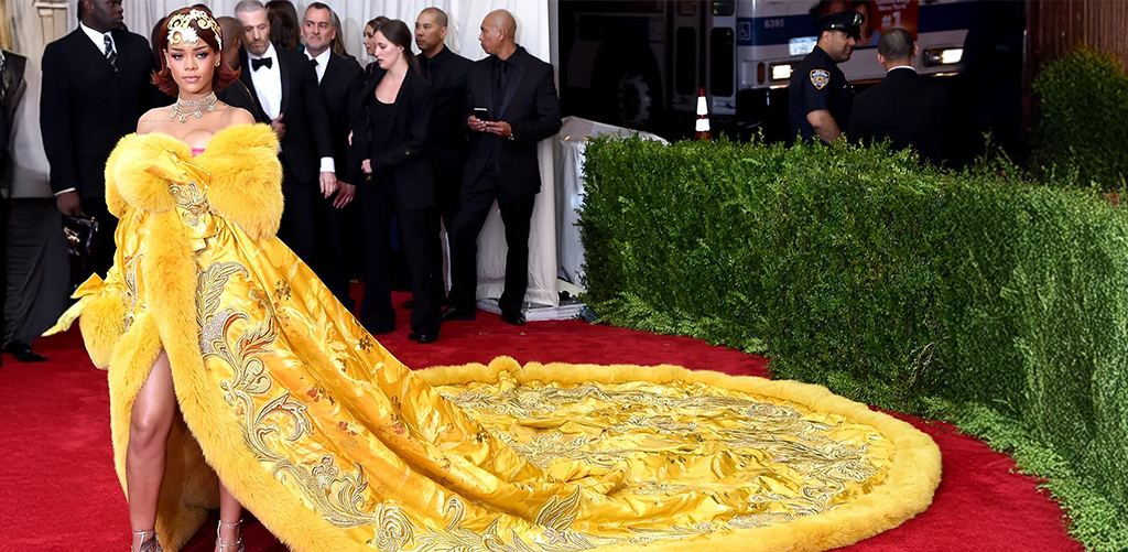
Think about Rihanna’s 2015 Met Gala look, a massive yellow fur-trimmed gown on a sea of neutral-toned celebs. She didn’t just show up; she popped. That’s fashion contrast done right.
At JD Institute, students are taught early on that visual contrast isn’t just for aesthetics, it’s crucial for clarity, hierarchy, and accessibility. Be it an interior layout or a magazine layout, it’s about guiding the viewer’s eyes to what matters most.
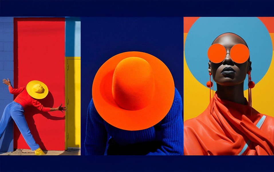
Some colors are just meant to clash, and that’s a good thing. Opposites on the color wheel, create maximum impact. Think red and green, blue and orange, yellow and purple.
Case in point: IKEA. The brand’s blue and yellow combo screams Scandinavian simplicity with instant recognizability. It doesn’t whisper, it yells but politely.

JD Institute in its communication design course explore color theory hands-on. From experimenting in textile labs to decoding audience psychology in branding workshops, the course teaches how contrast can build a color identity that’s unforgettable.
In Interior design, contrast isn’t just about color. It’s about texture, material, light, and layout. Think exposed brick against soft velvet, or sleek glass against warm wood.
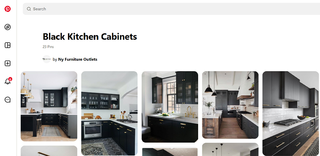
Pinterest went wild over black kitchen cabinets paired with white marble countertops. It’s dramatic, luxurious, and anything but boring.
Students at JD Institute are encouraged to experiment with such dynamic elements, from contrasting shapes in furniture layout to juxtaposing traditional crafts with modern minimalism. It’s all about making rooms feel alive.
Contrast isn’t just trendy, it’s essential for inclusive design. Low vision users, elderly audiences, and even distracted scrollers benefit when content is easy to see and navigate.
Google’s Material Design Guidelines emphasize high contrast for touch targets, text, and icons, because clarity isn’t optional anymore.

Design students must be taught how design with accessibility in mind boosts both function and ethical value. It’s not just about how good it looks, but also how usable it is for everyone.
In a world full of visual clutter, contrast is your shortcut to clarity, energy, and memorability. Whether you’re styling a photoshoot, revamping a living room, or launching a digital brand, contrast helps you focusing on essentials. And if you’re wondering where to learn how to make every element pop like a pro? That’s where JD Institute comes in, where design isn’t taught, it’s experienced. Through real-world projects, bold experimentation, and guidance from industry leaders, contrast becomes second nature.
Copyright © 2025 JD Institute of Fashion. All Right Reserved
Designed by


