
Ever noticed how Steve Jobs wore the same black turtleneck every day?
It wasn’t laziness, it was intentional simplicity. Just like Apple’s product design, his wardrobe was a minimalist power move that let his brain focus on what mattered most: innovation. In a world overwhelmed by noise, notifications, neon ads, and a thousand competing brands screaming for attention, simplicity doesn’t just stand out, it wins.
Whether it’s fashion, interiors, or digital experiences, minimal design cuts through the clutter. It’s not boring; it’s bold. And the best part? It works.
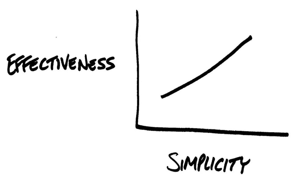
The human brain processes visuals 60,000 times faster than text. That means your design gets judged before anyone reads a single word. Now imagine giving someone a design cluttered with too many fonts, colors, or patterns, they’re likely to feel overwhelmed.
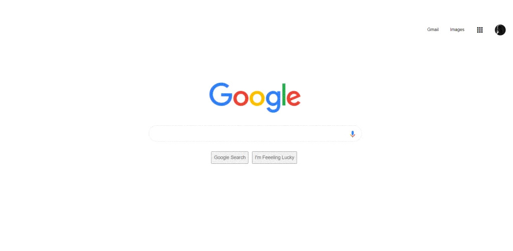
Take Google’s homepage. One logo, one search bar. That’s it. No chaos, no confusion. Just clarity.
In fashion, think of The Row by Mary-Kate and Ashley Olsen, monochrome tones, structured silhouettes, clean cuts. Their collections never scream, but they always speak.
At JD Institute, this philosophy is taught early on in both fashion and interior programs. Students learn how to translate complexity into elegance, whether it’s creating a modular outfit that serves multiple purposes or designing an interior space where every object has meaning.
When design is clean, the message is clear.
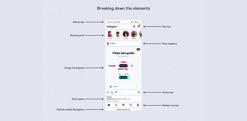
Minimalism helps the user focus on what really matters. This is especially important in UX design, where simplicity drives functionality. Ever used Instagram’s interface? Notice how intuitive it feels? That’s simplicity in UX working its magic.
IKEA’s interiors are another win for visual clarity, scandinavian minimalism that feels modern and livable. Their showrooms are proof that simplicity can still spark joy.
When Zendaya walked the 2024 Met Gala in a flowing, all-white sculptural gown, with zero embellishments, it broke the internet. Why? It was confident, pure, and effortless. Clean design is Instagram gold because it’s instantly shareable and universally appealing.
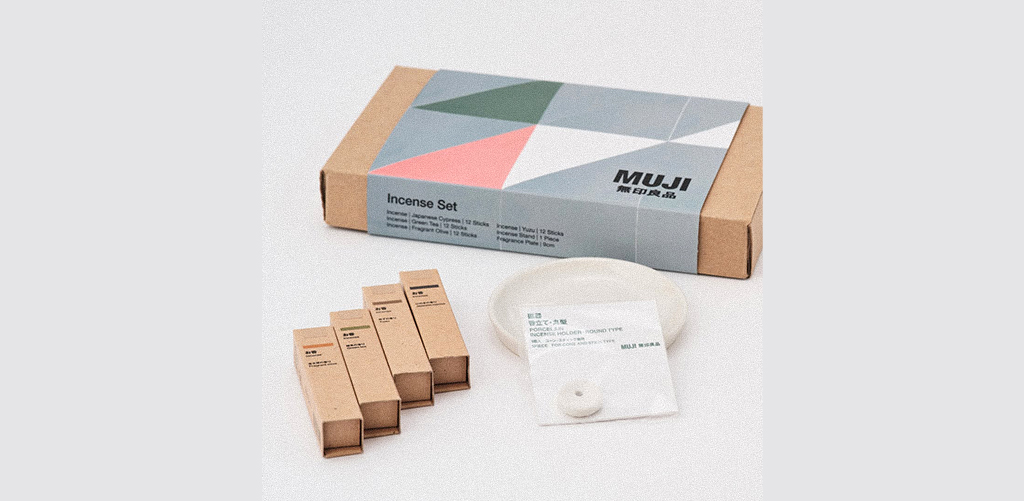
Look at Muji’s packaging, or Apple’s product boxes, white space, one logo, no distractions. This isn’t just branding, it’s a strategy. Viral design often relies on clean aesthetics to grab attention in milliseconds.
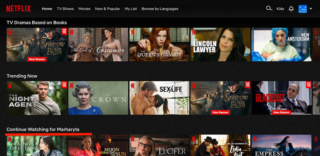
A clean layout signals professionalism, safety, and efficiency. Think about Netflix’s interface: minimal categories, strong visuals, zero fluff. It feels trustworthy.
In fashion branding too, brands like COS and Everlane use muted tones and clear typography. You instantly know they’re about quality and transparency.
At JD Institute, design students are also encouraged to design spaces that aren’t just aesthetic, but also user-conscious. That means layouts that breathe, light that flows, and objects that complement rather than compete. Simplicity becomes a habit, not a trend.
Here’s the twist, creating simple design is actually harder. It requires editing, decision-making, and a deep understanding of user needs.
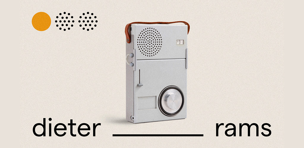
Dieter Rams, legendary designer for Braun, said: “Good design is as little design as possible.” But to get to that point, you need to know what to eliminate and why. That’s where true design education comes in.
Whether you’re working on a fashion show lineup, a spatial layout, or a brand identity, visual clarity and user focus are skills that must be learned, practiced, and refined.
In this busy world, people don’t have time to figure out your design. They need to feel it instantly.
So next time you sit down to create give your message space to breathe. Let your idea shine without the glitter. Because in the end, simple isn’t less, it’s everything. And if you want to master this art of clarity, confidence, and cool, maybe it’s time to learn where the next generation of minimalists are made, at JD Institute.
Copyright © 2025 JD Institute of Fashion. All Right Reserved
Designed by


