
Walk into a toy shop and you’ll see walls exploding with colours. Walk into a luxury watch boutique and suddenly, every detail feels expensive. Why the difference? Because colour is not just decoration; it’s strategy. And some of the smartest brands know that going dark sells better than going bright.
This is exactly why aspiring retail designers need to understand how colour psychology works in real spaces. The Visual Merchandising course by JD Institute goes beyond props and displays to teach how shades, tones, and even shadows change the way customers behave.
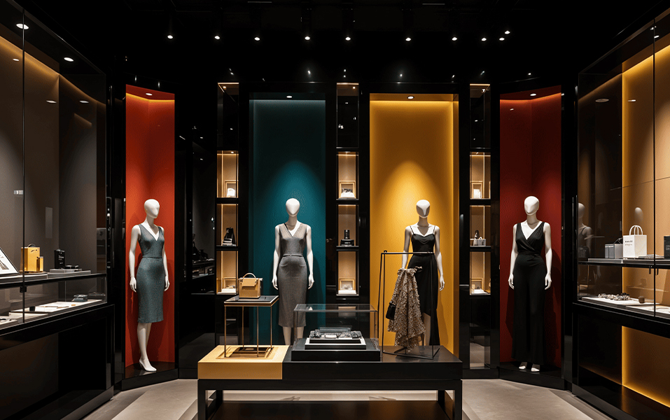
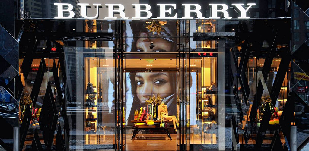
Dark colours quietly carry authority. Burberry’s stores, for instance, use muted greys and browns to give their iconic trench coats a timeless stage. You don’t see clutter, you see focus.
Gucci’s boutiques lean on deep velvets and rich tones to wrap shoppers in drama and luxury. The colours aren’t loud, but they hold attention with quiet confidence.
That’s the power of luxury colour psychology: darkness makes things feel rare, serious, and worth more.
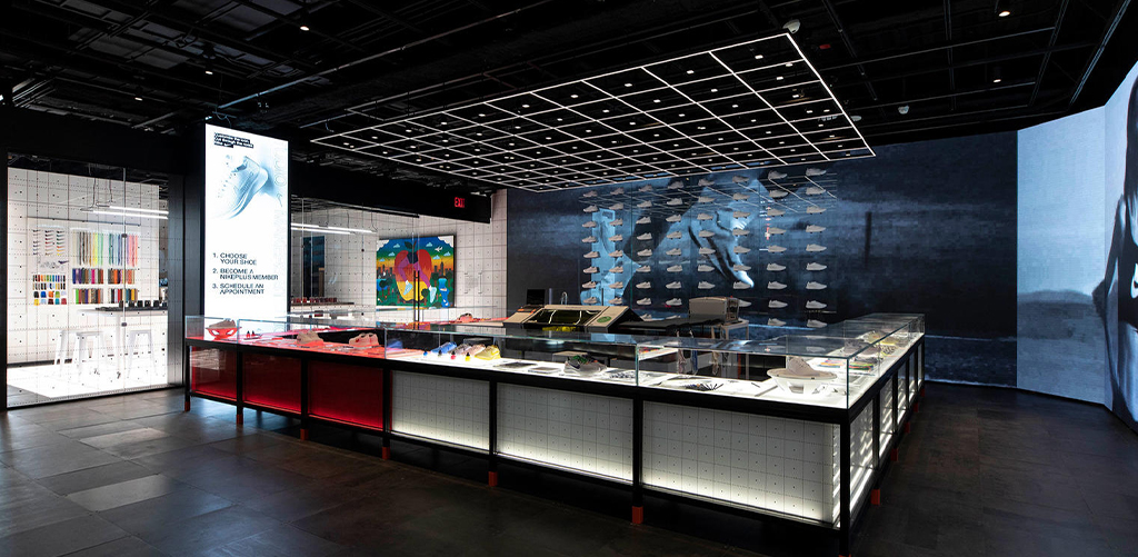
Nike’s flagship stores take a sharper approach. Their darker interiors, combined with spotlighting, make sneakers glow as if they’re under a theatre light. The vibe feels less like shopping and more like watching a performance.
For visual merchandising students, this is a crucial lesson: retail isn’t just about visibility, it’s about mood. And mood is what turns a regular store into a memorable one. That’s why the Visual Merchandising course at JD Institute focuses heavily on how atmosphere sells.
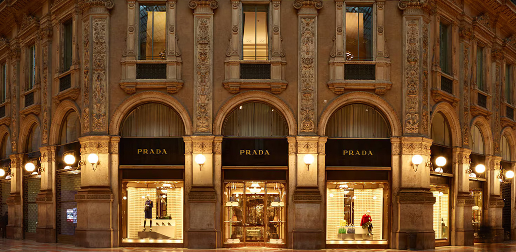
Nobody blinks at a high price when the environment makes it feel natural. Prada designs its stores with sleek, shadowy interiors that elevate handbags into art pieces.
Ralph Lauren’s Purple Label relies on mahogany wood and navy tones to give shoppers the sense of heritage and permanence. In such spaces, premium pricing feels like part of the experience.
This is where brand tone comes into play, where darker spaces carry a weight that bright ones often can’t.
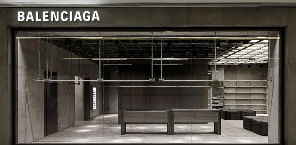
The smartest brands know not to drown in darkness. They use it with contrast. Balenciaga’s stores are moody like underground clubs, but paired with neon and bold signage to keep them energetic.
Louis Vuitton’s concept stores go another way: selective lighting makes products glow against dark walls, like treasures waiting to be discovered.
For merchandisers, it’s about designing colour language that fits the brand story. That’s the kind of design thinking sharpened at JD Institute, where strategy and creativity work hand in hand.
So, why some brands use dark colours instead of bright ones? Because darkness is never empty. It builds sophistication, sets mood, and frames value.
But here’s the twist, what works for Gucci might fail for a sneaker startup, and what feels right for Ralph Lauren won’t suit a toy store. The real skill lies in knowing when to go dark and how to balance it. That’s why training matters. The Visual Merchandising course by JD Institute doesn’t just teach decoration, it teaches persuasion through design.
Copyright © 2025 JD Institute of Fashion. All Right Reserved
Designed by


