
Have you ever walked past a store, saw a cool sign, and suddenly felt like going inside, even if you weren’t planning to shop? That’s not a coincidence. It’s not magic either. It’s good design.
Believe it or not, the fonts and signs you see outside a store have a huge influence on what you decide to buy. This is what we call typography in visual merchandising and it’s one of the most powerful tools in retail today.
If you’re someone dreaming of a career in visual merchandising, knowing how store signs and fonts influence what you buy is a big deal. That’s why the Visual Merchandising course at JD Institute gives students real knowledge about this skill, because it’s not just about decorating stores. It’s about understanding shoppers and what grabs their attention.
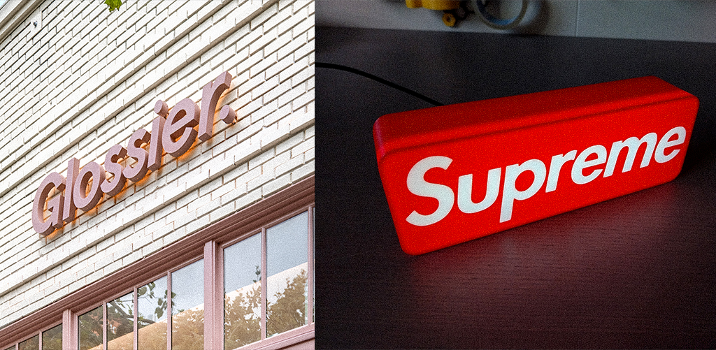
Example: Glossier vs. Supreme
Before you even read the words, your brain reacts to the style of the letters. So if Glossier uses soft, round fonts, it feels calming and pretty. But when Supreme uses bold, capital letters, it feels cool, bold, and confident. Every font gives a different feeling.
That’s why font choices are super important in signage design. Some fonts build trust. Some catch attention. Some make people feel like they need to buy something fast.
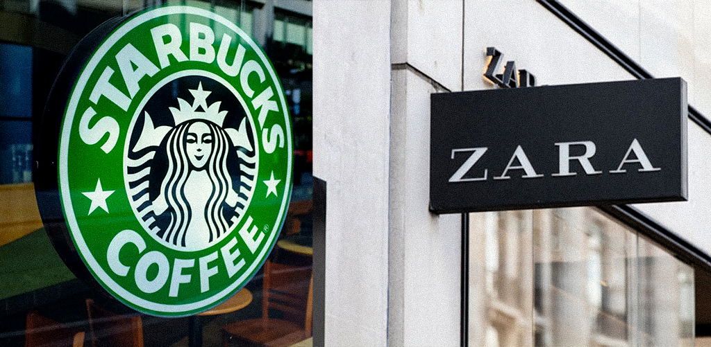
Example: Starbucks vs. Zara
Starbucks uses calming green colors with simple fonts to create a relax and enjoy kind of feeling. On the other hand, Zara uses black and white with sharp fonts to show elegance and high fashion.
When color and font work together, they create a mood. This is what smart retail branding is all about. People often don’t realize it, but these small details make them feel something, and that feeling leads to action.
As a visual merchandiser, you need to understand how to match colors with fonts depending on what the store wants to say.
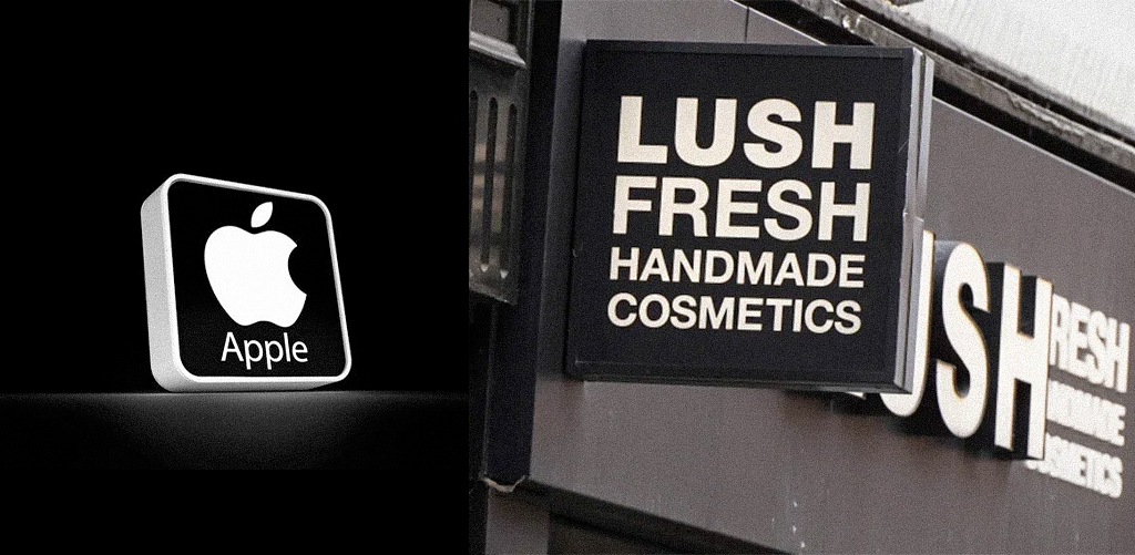
Example: Apple vs. Lush
Let’s say you’re designing for a tech brand like Apple. Would you use curly, flowy fonts? Probably not. Apple uses clean, simple letters because they reflect innovation and minimalism.
Now take Lush, a handmade cosmetics brand. They use messy, chalk-like fonts to feel fun and natural. This shows that retail font choices must match the product’s personality.
Luxury items need classy fonts. Fun, handmade items need playful fonts. Visual merchandisers need to understand this connection so they can help brands send the right message.
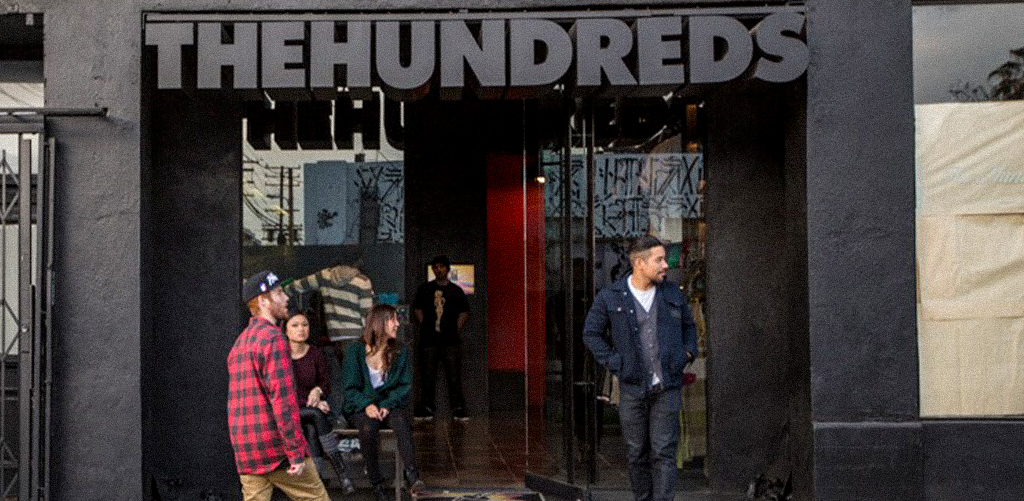
Example: The Hundreds (Pop-up store)
Pop-up shops don’t have big signs forever. So they make their signs super bold and eye-catching right from the start.
The Hundreds, a streetwear pop-up, used graffiti-style fonts and raw wooden boards to show they’re edgy and different. Even temporary signs need strong visual branding. Just because it’s short-term doesn’t mean it doesn’t need impact.
Students in visual merchandising must learn how to create fast, strong impressions, and that’s exactly what is in the course of Visual Merchandising at JD Institute.
Example: Urban Outfitters
When Urban Outfitters drops a new product, they use bold, loud fonts in bright colors to create urgency. People feel like if they don’t act fast, they’ll miss out. This is called emotional selling, and fonts play a big role in it. A simple word like “LIMITED” in a bright red font can push someone to make a purchase.
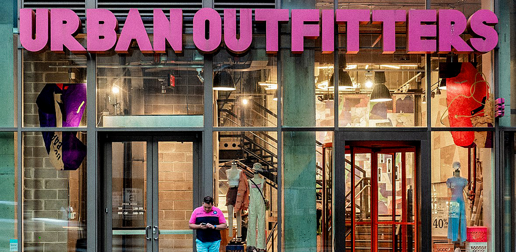
Visual merchandisers must learn how to use fonts not just for design, but for emotional connection.
Fonts don’t talk, but they say everything.
They guide people into stores, tell them what to expect, and even make them buy. That’s the power of typography in VM.
So if you’re planning to become a visual merchandiser, this skill isn’t optional, it’s essential. And if you’re wondering where to learn all this in a fun, hands-on, and professional way, you already know the name, JD Institute. Because when you know how design feels, not just how it looks, that’s when you become a true expert.
Copyright © 2025 JD Institute of Fashion. All Right Reserved
Designed by


