

A recent Houzz survey found that over 80% of homeowners regret poor space planning, not the color, not the furniture, but the layout. That tells you one thing, learning how to place things in a room isn’t just “nice to know”, it’s a must for future designers. That’s why we’re here to talk about the simple layout tips that every design student should know, things that might sound small but make a huge difference.
And if you’re planning to take your design dreams seriously, joining a good interior design course like the one at JD Institute of Fashion Technology will help you learn these tips and so much more!
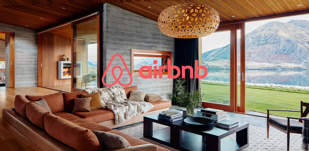
Before you place anything in a room, think that how will people walk around here?
That’s exactly how Airbnb designs their rooms. They don’t start with beds or couches, they plan how people will move through the space.
Quick Tip:
Leave enough space for people to walk easily, about 3 feet is great. Don’t block doors or make people squeeze past furniture.
Why this matters: It helps you design rooms that are not just pretty, but also easy to live in.
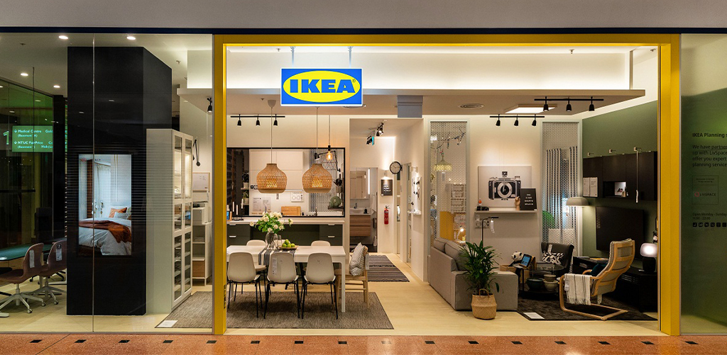
You know how people often push sofas against the wall to make the room bigger? Well, that’s not always the best idea.
IKEA shows us this with their smart layouts. They often place furniture in the middle, not touching the walls. It actually makes the room feel cozy and balanced.
Quick Tip:
Try creating small seating areas around a coffee table or rug. This makes the space feel warm and inviting.
And midway through your design journey, enrolling in a program like JD Institute’s Interior Design course will help you refine that thought process and add technical skills to your creative instincts.
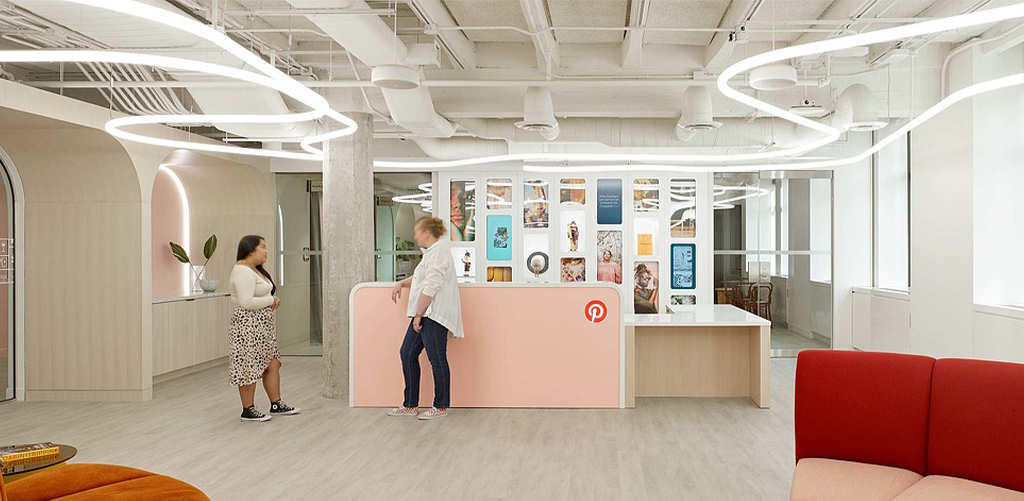
Have you seen Pinterest’s office spaces? They look cool, but not everything is matching. That’s the secret: balance doesn’t mean symmetry. You don’t need two same-sized chairs on both sides. You can balance one big lamp with two small plants, it’s all about how things feel.
Quick Tip:
Mix shapes, sizes, and heights. As long as both sides of the room feel even, you’re good.
Why it works: Balanced layouts are easier on the eyes and feel more natural. As a student, training your eye for visual balance can elevate your work from basic to brilliant.
Inspired by: Apple Stores’ interior design strategy
Apple doesn’t just design tech, they also design emotions. Their stores follow the rule of thirds which means dividing the space into horizontal and vertical thirds to place focal elements strategically.

Layout Tip: Divide your room into a 3×3 grid. Place key features sofa, artwork, lighting where the lines intersect. It creates instant visual harmony.
Why it matters: Whether you’re designing a boutique or a bedroom, understanding these invisible lines makes a layout feel intentional and premium.
Inspired by: The Minimalists & Muji’s design philosophy
Minimalism is not just an aesthetic, it’s a lifestyle. Brands like Muji and The Minimalists show how fewer, well-placed pieces can make a space feel bigger, cleaner, and more functional.

Layout Tip: Before adding, subtract. Ask yourself that does this piece serve a purpose or is it just filling space?
For aspiring designers: Every piece you add should have a reason. Less clutter means more clarity, especially when presenting client projects or portfolio work.
Every room you design can shift how someone feels, works, or rests. It’s a superpower, and learning these layout basics is your first step.
If you’re serious about becoming a designer who stands out, study where creativity meets real-world technique, study smart, study with JD Institute.
After all, anyone can make a room pretty. But only a designer knows how to make it unforgettable.
Copyright © 2025 JD Institute of Fashion. All Right Reserved
Designed by


