
The way you hang your art can make your space feel bigger, warmer, or even more expensive. And guess what? There are rules. Not boring ones, but stylish ones.
So whether you’re styling a cozy living room, a dramatic hallway, or building a gallery wall for your creative project, let’s break down the do’s and don’ts of hanging art on walls, with real examples, smart tips, and yes, a little designer drama.
If you’re a design enthusiast or an aspiring interior design student, this is a must-know territory. In fact, students at JD Institute of Fashion Technology dive deep into visual composition, spatial harmony, and art placement techniques, because these small details shape the big picture.
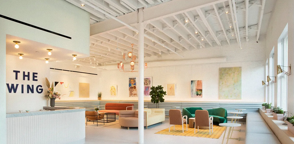
Example: The Wing (New York) — This women-focused co-working space uses art as narrative. Their gallery walls reflect empowerment, diversity, and creativity, and it’s not by accident.
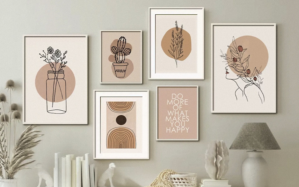
Every piece of art should say something either through color, subject, or placement. Think of your wall as a mood board. Ask: What story am I trying to tell?
Pro tip: Keep the center of your artwork roughly at 57-60 inches from the floor, the average eye level. This is museum standard for a reason!
Example: Airbnb Offices (San Francisco) — They redesigned their spaces to resemble the homes listed on their platform. One of their early design fixes? Lowering all the artwork! Art floating near the ceiling looks disconnected and awkward.
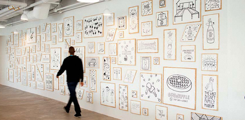
Whether it’s a single piece or a whole gallery, art should feel anchored to furniture — not floating above it. A good rule: Keep art about 6–8 inches above furniture like sofas or headboards.
Example: Glossier Showrooms (LA & NYC) — Before mounting anything, their teams use cut-out templates to test different wall arrangements. It’s smart and saves walls from a million nail holes.
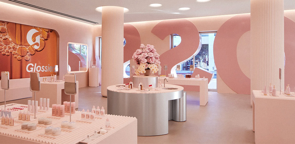
Use kraft paper cutouts taped on the wall to experiment with different layouts. This works wonders, especially when you’re building a gallery wall. Also? Snap a picture of your layout and take a step back. Your camera lens catches things your eye might miss!
And this is where Interior Design students get real-time learning at JD Institute, experimenting with physical layouts and understanding visual weight and balance.
Example: Apple Stores Worldwide — Ever noticed how nothing ever feels too small or too big? That’s strategic. Apple’s designers understand proportion deeply, and that applies to wall art too.
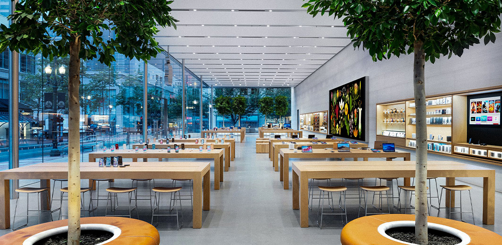
Tiny frames on large empty walls? They’ll look like stickers. And oversized prints on a narrow column? Just chaotic. Match the size of your art with the scale of the wall or group smaller frames for visual balance.
Hanging art isn’t just about walls. It’s about knowing how to translate mood, culture, and function into visual harmony. Every designer, whether in interiors or fashion, needs to understand placement. It teaches balance, storytelling, and intentional design. That’s why the Interior Design course at JD Institute of Fashion Technology doesn’t stop at theory. Students learn by doing from gallery walls to styling lifestyle shoots, from color curation to exhibition spaces.
Copyright © 2025 JD Institute of Fashion. All Right Reserved
Designed by


