
Typography has been an important part of Communication Design, particularly in the field of graphic design for a long time, and it’s also the main way that people communicate. However, there has been a big change in recent years towards bold and unconventional typography as designers try to stand out and leave an impression that people will remember. This trend is changing everything about design, from websites and apps to print media. Educational institutions like JD Institute of Fashion Technology are leading the way in embracing and teaching these new ways of doing things.
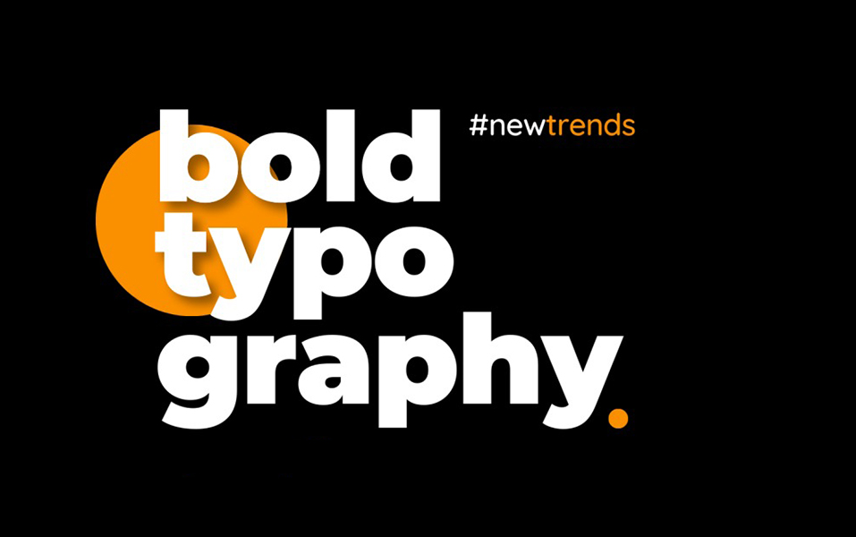
Bold typography plays a crucial role in establishing visual hierarchy within design projects. Bold typography is more than just using bigger or thicker letters. It’s about making an emphasis. Fonts with different weights and sizes help designers guide the viewer’s eye and draw attention to important messages. This makes it easier for users to find their way around and understand the content.
Branding content like Nike’s ads or Apple’s product releases use bold, sans-serif fonts that help these companies stand out. Their choices in font show what they stand for: confidence, new ideas, and clarity. They are doing this on purpose to make sure that people see and remember their words.

When you use unconventional typography, you don’t just use standard fonts; you also use artistic expressions. It means using special fonts, customised characters, or even text layouts that don’t follow the rules. This trend gives designs a unique look that makes them more interesting and easy to remember.
Below are the reasons why this type of Typography Works-
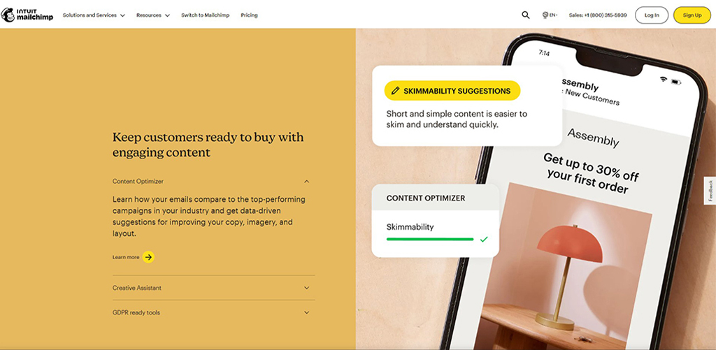
The typography on Mailchimp’s website isn’t typical; it uses fun and unique styles. Using strange typefaces and putting text in strange places gives the company personality and shows that it is creative and easy to talk to.
In digital media, using big, unconventional fonts can also be very important for getting and keeping people’s attention. Digital material that uses eye-catching typography can be more interesting and memorable, which can make people want to interact with it and stay on the page a bit longer.
For example, Medium’s use of bold typography in its article headers and section titles enhances readability and engages readers. The clean, bold typefaces used in the platform’s design ensure that key information stands out and captures the reader’s attention.
Typography that is strong and out of the ordinary has many benefits, but it also has certain drawbacks. It’s important for designers to find a balance between creativity and readability, making sure that their unique type solutions don’t make the text harder to read. It is also important to look at the design as a whole to make sure that bold lettering goes well with other layout aspects.
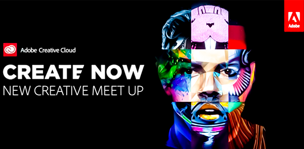
Advertisements for Adobe Creative Cloud often use large fonts to make an impressive visual effect. The challenging task is making sure that the bold styles don’t get in the way of the main message or make it hard to read. Adobe carefully.
It’s likely that the trend of bold and unconventional fonts will keep changing as new technologies and design methods push the limits of what’s possible. Even more creative typography, interactive layouts, and new ideas fueled by progress in digital technology may be on the way in the future. Google Fonts is always adding fresh fonts to its catalogue that are different from the norm and push the limits of design. Google lets designers use bold and distinctive fonts in their projects by giving them a wide selection of fonts.
By embracing these trends and pushing the boundaries of Communication Design, JD Institute students are equipped to create impactful and memorable work that stands out in an ever-evolving visual landscape. As typography continues to evolve, the emphasis on bold and unconventional designs will likely become even more central to the future of design.
Copyright © 2025 JD Institute of Fashion. All Right Reserved
Designed by


