Apply Now

Author Archive

TV Characters Are the New Trendsetters- Here’s Why Stylists Need to Notice

Thursday, August 21st, 2025

You know you’ve been influenced by a TV show when you start googling where to buy Rachel Green’s skirt or Sheldon Cooper’s T-shirts.

Television doesn’t just entertain us, it sneaks into our wardrobes. From the funky 90s fits of Friends to the luxe power suits in Suits or the pastel-perfect looks from Bridgerton, TV fashion influence is everywhere. What we binge often decides what we wear, whether we consciously realize it or not.

For aspiring stylists, understanding this connection is crucial. That’s exactly why at JD Institute’s Fashion Styling course, students explore not just clothes, but also how media shapes taste, trends, and consumer choices.

From Script to Sidewalk

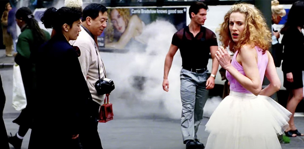
Every character we watch is carefully dressed by professional costume stylists. Their job is not just about looking good, but telling a story. Take Sex and the City– Carrie Bradshaw’s tutu skirt in the opening credits wasn’t random; it defined her quirky, fashion-first personality.

This is what costume styling really does: it creates characters we relate to so much that their style spills into our real lives. Think about the plaid skirts from Gossip Girl, suddenly school uniforms everywhere had a makeover. That’s TV fashion influence working in full swing.

For fashion students, the lesson is clear: learn how to decode storytelling through clothes.

Iconic Examples

The influence of TV on fashion isn’t subtle, it’s massive. Here are a few cool examples of how shows changed everyday wardrobes:

  • Friends: Rachel Green practically invented the 90s casual chic look, which was mini skirts, slip dresses, cropped sweaters. These are still trending on Pinterest mood boards.
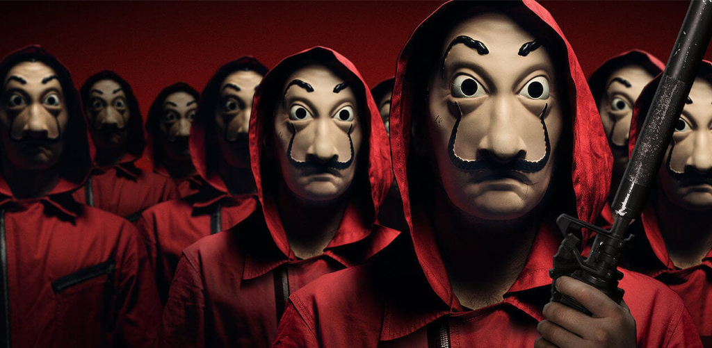
  • Money Heist: The red jumpsuit and Salvador Dali mask became a global fashion statement. Costume styling here created not just looks but a movement.
  • Euphoria: Bold glitter makeup, rhinestones, and vibrant fits made Gen Z fall in love with experimental styling. It sparked an entire wave of “festival looks.”
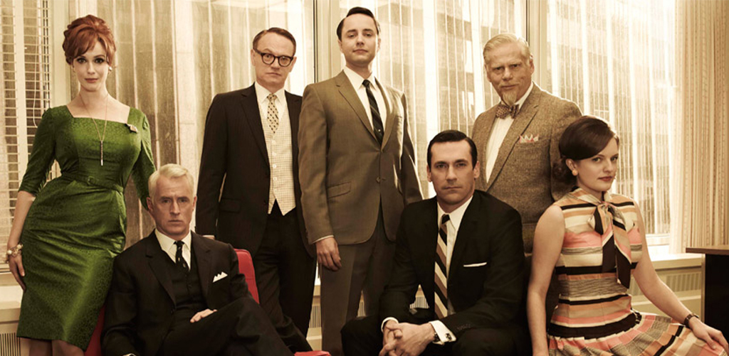
  • Mad Men: Vintage-inspired tailoring and polished office wear made mid-century silhouettes cool again.

If you’re aiming to be a stylist, here’s the catch: audiences don’t just watch shows; they consume styles. This is why you must train yourself to notice how visual culture shapes buying choices.

Why Fashion Styling Students Must Pay Attention

So, why should an aspiring stylist even care about this stuff? Because:

Trends Start on Screen – What appears on Netflix today often becomes the Instagram trend tomorrow.
Pop Culture = Demand – Stylists who understand pop culture references can predict what clients will ask for.
Storytelling Skills – Dressing isn’t only about matching colors; it’s about giving someone a personality.
Career Edge – Brands are always looking for stylists who “get” cultural shifts.

That’s exactly why the Fashion Styling course at JD Institute goes beyond basic wardrobe tips as it teaches students to think like cultural analysts.

Lessons from TV Fashion Startups and Brands

Some startups and brands have been super smart in catching this trend:

  • Reformation & Friends Collaboration: Capitalized on Rachel Green’s timeless outfits.
  • PrettyLittleThing x Euphoria Looks: Turned the glittery, bold makeup and styling into a fast-fashion collection.
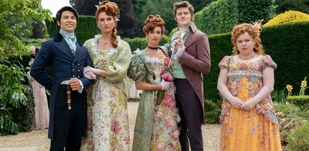
  • Revolve’s Bridgerton-Inspired Line: Took the regency-core hype and turned it into a sellout collection.

The takeaway for students? Learn to connect trends with business opportunities. If TV-inspired styles can make global brands millions, imagine what you can do with the right knowledge.

Why It’s Smart to Learn Styling Now

If you’re serious about fashion becoming a stylist, you need to train yourself to see the above mentioned details. The Fashion Styling course at JD Institute is where you’ll learn how to decode trends, style with purpose, and get industry-ready with the tools to shape fashion’s future.

So don’t just watch shows for fun, watch them with a stylist’s eye. The next big fashion wave might be on your screen right now. Why not be the one to turn it into the next big trend?

STEM Festivals Are Outshining Concerts- Here’s What Event Managers Should Learn

Thursday, August 21st, 2025

In today’s world of STEM festivals, audiences don’t just want to watch; they want to feel, touch, and get amazed by science. From school kids to CEOs, these events are proving that curiosity is contagious.

And if you’re an aspiring event management student, this is where you should be paying close attention. In fact, the Global Event Management course by JD Institute teaches exactly how to craft such experiences that blend education with entertainment.

The Rise of Science Event Trends

Once upon a time, science fairs were small exhibitions with poster boards and model volcanoes. But today? They look more like Coachella with lab coats. Major cities host interactive science shows featuring laser light experiments, robotics battles, and VR simulations.

Take Maker Faire, for example. What started as a small gathering of tech hobbyists in California is now an international movement attracting thousands.

It’s proof that when science goes hands-on, crowds line up. These science event trends are teaching us one thing: experiments aren’t boring, they’re blockbuster-worthy.

Where Learning Feels Like Play

People don’t just attend science festivals to learn, they go to be wowed. This is where educational entertainment comes in. Think of it as Netflix meets NASA.

Consider TED-Ed Clubs and Brainiac Live in the UK. Their shows combine humor, explosions, and quirky storytelling to make science unforgettable. For event managers, the lesson is clear: the audience is hungry for knowledge, but they’ll only stay hooked if it feels like playtime.

Here’s where event students can learn a big trick, designing experiences, not just events. And that’s exactly the kind of skill polished in the Global Event Management course by JD Institute, where students study how to keep audiences engaged across different formats.

Innovation on Display

It’s not just universities or museums making noise, startups are turning science into spectacles. Companies like Science Made Simple (UK) or Curiosity Machine (US) build interactive activities that blend real science with crowd fun.

One striking example? Exploratorium in San Francisco, a startup turned global sensation that hosts “After Dark” events where adults sip cocktails while experimenting with science exhibits. That’s science plus nightlife, a combination you wouldn’t expect but one that absolutely works.

For event managers, the takeaway is simple: innovation doesn’t have to be expensive, but it has to be smart. Find fresh ways to connect ideas with people.

The Secret Ingredient of STEM Festivals

The magic of science festivals lies in one word: engagement. It’s not enough to show a cool experiment; audiences want to be part of it.

Look at India Science Fest, where kids and adults get hands-on with experiments, AI demos, and even space tech booths. Or Pint of Science, where science talks happen in pubs, turning casual spaces into learning hubs. These events prove that when science steps out of the classroom, it pulls people in like never before.

For aspiring event managers, this is an unmissable lesson: audience interaction is king. Whether it’s fashion, design, or science, events thrive when the audience feels like co-creators.

What Aspiring Event Management Students Should Learn

If you’re dreaming of managing global-scale events, STEM festivals are a masterclass in creativity, logistics, and crowd psychology. Here are the key lessons:

  • Storytelling beats plain showcasing – experiments must tell a story.
  • Tech is your best friend – from VR to AR, event tech keeps audiences hooked.
  • Crowd flow matters – how people move, participate, and share shapes the success of your event.
  • Adaptability is everything – trends change fast, and events must evolve with them.

This is why students must learn to design real experiences for real people, across industries.

Why Future Designers Should Care

Because the rules of engagement are the same everywhere. If experiments can attract thousands, your fashion showcase or design exhibition can too, provided you learn how to make it interactive, fun, and unforgettable. And where do you learn this art of event magic? At a place that mixes creativity with strategy- JD Institute. Don’t just plan events, plan experiences that people will remember long after the lights go down.

What Every Communication Designer Should Learn from Simple Icons

Wednesday, August 20th, 2025

“Did you know the first-ever restroom sign was designed not for fashion, but for survival?” Yet, this little fact tells us something huge, that design isn’t just about beauty, it’s about making life easier, safer, and sometimes even saving lives. And nothing proves this better than the world of universal icons. From hospitals to airports, a single symbol can guide thousands of people, even when they don’t share the same language.

This is where communication design becomes a real game-changer. Let’s dive into how a simple icon can save lives and why you, as an aspiring designer, should pay close attention.

Why Icons Beat Words in a Crisis

Imagine you’re at an airport in a foreign country. You don’t speak the language, your flight is about to leave, and you need to find Gate 32. Do you start reading long boards full of text? Nope. You scan for that little airplane symbol and run. That’s the magic of icons, they’re instant, universal, and emotion-proof.

Take Airbnb’s “Bélo” icon, for example. It’s not just a logo; it was designed to stand for “belonging” no matter where you are.

While it’s not life-saving, it shows how one simple shape can communicate volumes globally. Now, imagine this same clarity applied to emergency exits or hospital wards, this is where icons move from cool to crucial.

Hospitals: Where Seconds Matter

In hospitals, confusion can literally cost lives. Patients and visitors don’t have the time to decode complicated text signs. Instead, a red cross instantly signals medical help. A baby icon quickly directs anxious parents to the pediatric ward.

Look at Startups like Practo, which simplified healthcare access with app icons that lead users to doctors, tests, and pharmacies instantly.

They proved that good iconography reduces panic and speeds up action. For communication design students, this is a lesson in empathy: design isn’t just what looks pretty, it’s what works fast.

Airports: Design for the World, Not Just One Country

Airports are melting pots of cultures, languages, and urgency. A single confusing sign could cause a passenger to miss a flight or worse, enter a restricted zone. That’s why airports like Changi in Singapore or Heathrow in London invest heavily in universally understandable symbols.

Think of Duolingo’s green owl icon. Even if you’ve never used the app, you instantly get that it’s about learning. Airports work the same way, one look at a suitcase symbol and you know it’s baggage claim. Simple icons bridge massive cultural gaps and make stressful environments easier to navigate.

And yes, this is exactly the kind of problem-solving mindset taught in the Communication Design program at JD Institute, where you’ll learn to design with clarity and inclusivity at the forefront.

Emergency Signage: Icons That Save Lives

Emergencies don’t wait for instructions. If a fire alarm goes off, people don’t stop to read “Exit this way.” They follow the glowing green running man symbol, trusted worldwide. That icon has saved countless lives in fire drills and real evacuations.

Startups like Blinkit (formerly Grofers) leaned on this kind of fast recognition by using a bold, simple lightning-bolt logo to signify “speed.” People instantly understood the service promise. The same psychology applies in emergencies, our brains trust a bold, clear symbol over any sentence.

For aspiring designers, this is a wake-up call: simplicity is not laziness; it’s brilliance.

What Aspiring Communication Design Students Should Learn

If there’s one thing to take away, it’s this- communication design is not decoration, it’s direction.As an aspiring communication design student, you should practice:

  • Designing for clarity, not clutter
  • Understanding cultural neutrality in icons
  • Creating visuals that work across print, digital, and physical spaces
  • Testing your work on people who don’t know the language

This is why at JD Institute’s Communication Design program you’ll learn to design not for one audience, but for everyone, because that’s what the world needs.

Want Your Interiors to Pop? Master These Color Schemes

Tuesday, August 19th, 2025

“Color is the keyboard, the eyes are the harmonies, the soul is the piano with many strings.” – Wassily Kandinsky.

Ever thought of how a simple shade of blue can either calm you or make you feel cold, depending on how it’s paired? That’s the magic of color harmony. Whether you’re painting a room, designing a logo, or styling an outfit, colors decide how people feel.

For anyone stepping into design, especially aspiring interior designers, mastering design color theory is like learning the ABCs of creativity. At JD Institute’s Interior Design course, this is one of the first things students get introduced to, because without color sense, design feels incomplete.

Monochrome: One Color, Many Moods

Think of Apple’s product designs. Sleek, clean, and often sticking to whites, silvers, or blacks. That’s the power of a monochrome scheme, using just one base color but exploring all its shades, tints, and tones.

Why it works:

  • Creates simplicity and elegance.
  • Perfect for minimal designs where clutter is the enemy.
  • Makes spaces feel unified and polished.

Interior designers often use monochrome when they want a modern, chic look. For students, understanding monochrome helps you appreciate how “less is more” actually works. It teaches restraint and forces you to get creative with textures, shapes, and light.

Analogous: Colors That Play Well Together

Ever seen the Instagram logo? It’s a burst of pink, purple, and orange that just feels right. That’s analogous colors in action, three to four colors that sit next to each other on the color wheel.

Why it works:

  • Creates harmony because the colors naturally blend.
  • Best for themes that want warmth, flow, or softness.
  • Often seen in nature: think of a sunset blending orange to pink to purple.

In interiors, analogous colors can make a space cozy and inviting. 

At JD Institute, students explore how analogous schemes can be used not just in interiors but also in branding and fashion styling. Knowing how colors interact makes you a smarter designer who can work across industries.

Complementary: Opposites That Attract

Think of FedEx’s logo, that is bold orange and purple. Or Pepsi’s iconic red and blue. That’s complementary colors, two shades that sit opposite each other on the color wheel. They create contrast that pops.

Why it works:

  • Instantly grabs attention.
  • Balances energy: one color makes the other shine brighter.
  • Perfect for dramatic, high-impact designs.

In interiors, designers often use complementary schemes in accents. For beginners, complementary colors teach confidence. They remind you that sometimes, the boldest risks create the best results.

Wrapping It Up

At the end of the day, understanding Monochrome, Analogous, Complementary is like learning grammar before writing poetry. Once you know the basics, you can bend the rules, experiment, and build your own style.

Think of the timeless elegance of Chanel boutiques that often lean into a monochrome palette, or the cozy warmth of Starbucks interiors that rely on analogous earthy tones. Even bold hotel lobbies like W Hotels use complementary contrasts to make a statement. These aren’t just coincidences, they’re smart design moves powered by color theory.

If you’re serious about stepping into this world, learning Interior Design at JD Institute gives you both the theory and the playground to try it all out.

The Untold Power of Dark Colours in Visual Merchandising

Tuesday, August 19th, 2025

Walk into a toy shop and you’ll see walls exploding with colours. Walk into a luxury watch boutique and suddenly, every detail feels expensive. Why the difference? Because colour is not just decoration; it’s strategy. And some of the smartest brands know that going dark sells better than going bright.

This is exactly why aspiring retail designers need to understand how colour psychology works in real spaces. The Visual Merchandising course by JD Institute goes beyond props and displays to teach how shades, tones, and even shadows change the way customers behave.

Luxury Colour Psychology 

Dark colours quietly carry authority. Burberry’s stores, for instance, use muted greys and browns to give their iconic trench coats a timeless stage. You don’t see clutter, you see focus.

Gucci’s boutiques lean on deep velvets and rich tones to wrap shoppers in drama and luxury. The colours aren’t loud, but they hold attention with quiet confidence.

That’s the power of luxury colour psychology: darkness makes things feel rare, serious, and worth more.

The Store as a Stage

Nike’s flagship stores take a sharper approach. Their darker interiors, combined with spotlighting, make sneakers glow as if they’re under a theatre light. The vibe feels less like shopping and more like watching a performance.

For visual merchandising students, this is a crucial lesson: retail isn’t just about visibility, it’s about mood. And mood is what turns a regular store into a memorable one. That’s why the Visual Merchandising course at JD Institute focuses heavily on how atmosphere sells.

Justifying the Price Tag

Nobody blinks at a high price when the environment makes it feel natural. Prada designs its stores with sleek, shadowy interiors that elevate handbags into art pieces.

Ralph Lauren’s Purple Label relies on mahogany wood and navy tones to give shoppers the sense of heritage and permanence. In such spaces, premium pricing feels like part of the experience.

This is where brand tone comes into play, where darker spaces carry a weight that bright ones often can’t.

Using Contrast Right

The smartest brands know not to drown in darkness. They use it with contrast. Balenciaga’s stores are moody like underground clubs, but paired with neon and bold signage to keep them energetic.

Louis Vuitton’s concept stores go another way: selective lighting makes products glow against dark walls, like treasures waiting to be discovered.

For merchandisers, it’s about designing colour language that fits the brand story. That’s the kind of design thinking sharpened at JD Institute, where strategy and creativity work hand in hand.

Why Aspiring Merchandisers Should Care

So, why some brands use dark colours instead of bright ones? Because darkness is never empty. It builds sophistication, sets mood, and frames value.

But here’s the twist, what works for Gucci might fail for a sneaker startup, and what feels right for Ralph Lauren won’t suit a toy store. The real skill lies in knowing when to go dark and how to balance it. That’s why training matters. The Visual Merchandising course by JD Institute doesn’t just teach decoration, it teaches persuasion through design.

Why Fashion Students Should Add Coding to Their Sketchbooks

Monday, August 18th, 2025

“Did you know the first computer algorithm was written by a woman, named Ada Lovelace, in the 1800s?”

Fast-forward to today, and women and men are writing codes that power everything from Instagram filters to AI-generated fashion shows. Now here’s the twist, coding isn’t just for tech geeks. It’s sneaking into fashion studios, runways, and even your favorite shopping apps. That’s why the big question of our time is why fashion designers should learn basic coding, because the future of fashion isn’t just stitched. 

And if you’re an aspiring designer wondering how this fits into your journey, courses like the Fashion Design program at JD Institute are already prepping students to merge creativity with technology. Let’s break down why fashion and coding are a hotter combo than denim and leather.

Digital Fashion is Exploding

Have you ever bought a virtual sneaker skin on Fortnite or seen someone flexing digital dresses on Instagram? That’s not Photoshop magic, it’s fashion tech. Startups like The Fabricant, a digital-only fashion house, are creating outfits that exist only online. Their designs sell for thousands, and they don’t even touch fabric.

For designers, learning coding for designers means you can actually build your own digital clothes, experiment with AR try-ons, or even design for the metaverse. Imagine showcasing your collection on a virtual runway without spending on production.

Fashion Tools are Going Digital

From pattern-making to color-matching, almost everything in fashion now has a digital tool behind it. Platforms like CLO 3D and Browzwear let you create hyper-realistic clothing samples that move like real fabric. Guess what makes them work? Code.

When you understand even the basics of fashion digital tools, you’re not just using the software, you’re customizing it. Designers who know coding can tweak tools, automate boring processes, and even invent their own creative plug-ins. That’s like having scissors that sharpen themselves.

Startups Love Tech-Savvy Designers

Fashion entrepreneurs today aren’t just sketching, they’re pitching ideas that live online. Think of Stitch Fix, which uses algorithms and AI to suggest outfits for millions of people. Without the marriage of fashion and coding, that business model wouldn’t even exist.

As an aspiring designer, if you can blend style with coding, you become way more valuable in the startup world. While others wait for a tech team, you can prototype your own digital fashion ideas. That’s the edge employers and investors notice.

In fact, many students at the JD Institute’s Fashion Design course explore projects that mix creativity with tech innovation, because that’s exactly where the industry is headed.

Coding Sparks Unexpected Creativity

Think coding sounds boring? Not really. Coding is just another form of design, but instead of fabric and thread, you’re playing with logic and functions. Many creative coders are already proving this. For example, Iris van Herpen, famous for her 3D-printed dresses, uses coding to make patterns that would be impossible by hand.

When you know even a little bit of coding, you start seeing new possibilities. Maybe you’ll design a dress that reacts to light, or sneakers that sync with a fitness app. It’s not replacing creativity, it’s giving it superpowers.

Smart Fashion = Smart Designers

Wearable fashion is no longer science fiction, it’s on the runway. Brands like CuteCircuit are designing dresses that light up with LEDs and even respond to social media likes. Another startup, Nadi X, built yoga pants with sensors that guide your posture through gentle vibrations.

These ideas don’t happen with fabric alone, they need code. For designers who understand coding, creating smart fashion means you can actually bring innovation to life. Imagine being the one who designs jackets that warm up automatically or handbags that charge your phone. That’s the power of mixing fashion design with coding basics.

The Bottom Line: Code is the New Couture

Fashion has always been about reinvention. From corsets to crop tops, the industry evolves with time. Now, the revolution is digital, and coding is its language. Learning it doesn’t mean you stop sketching, it means your sketches have the chance to come alive in ways that weren’t possible before. And if you’re serious about stepping into this fashion future, why not start where creativity meets innovation? The Fashion Design program at JD Institute is already teaching students how to design for the real world and the digital one. Maybe it’s time you script your fashion journey too.

What Every Styling Student Should Learn from Covers

Wednesday, August 13th, 2025

A great cover doesn’t just make you look, it makes you stop.

That’s the magic of a magazine cover. It’s not just a picture; it’s a silent conversation with the world, telling you this is the story you didn’t know you needed. From bold fashion statements to subtle beauty cues, the art of styling for magazine covers is a craft that blends creativity, psychology, and storytelling.

If you’re an aspiring fashion stylist, understanding how covers are made is like unlocking the cheat code to visual impact. This is exactly the kind of deep, hands-on insight students explore in the Fashion Styling course by JD Institute, where the runway meets the reality of professional shoots.

It’s About a Mood

Every magazine cover has an emotion behind it; fierce confidence, dreamy romance, rebellious energy. Editorial styling starts with deciding what the cover needs to feel like, not just what it should look like.

Think about Rihanna’s British Vogue cover in a durag, which was a bold style choice that was as much about cultural commentary as it was about aesthetics. Or Zendaya’s Elle spread, which channeled retro glamour with modern flair. The clothing, makeup, and even lighting work together to send one clear message: this is the vibe.

Aspiring stylists must learn how to build a mood board, research cultural trends, and guide the creative direction, that are the skills that go far beyond just picking outfits.

The Cover Look Is a Team Sport

In magazine fashion shoots, nothing happens in isolation. The stylist collaborates with photographers, makeup artists, set designers, and even the editor-in-chief to ensure the “cover look creation” feels connected.

A great example? The Vogue September Issue cover with Beyonce, shot by Tyler Mitchell. The styling embraced natural tones and floral crowns, paired with minimal makeup, a result of tight teamwork between the creative and editorial teams.

Future stylists must know how to communicate ideas, adapt on set, and solve last-minute problems, because a blow of wind or a wardrobe malfunction can happen anytime.

Trends Don’t Rule, They Whisper

While trends influence editorial styling, the best covers don’t simply follow the trend, they set it. Think of Lady Gaga’s Vogue Japan cover where the metallic sculptural dress wasn’t “in season” yet, but became a fashion talking point for months.

Learn how to predict the next big thing. That means reading fashion forecasts, observing street style, and experimenting with bold choices. In the Fashion Styling program at JD Institute, students explore these trend-spotting skills and practice making fashion decisions that feel fresh, not forced.

Details Make the Difference

Look closely at any iconic cover, and you’ll notice the magic is in the details. A slightly tilted hat, the pop of a contrasting shoe, or the way a scarf drapes over a shoulder, these tiny decisions can make a cover unforgettable. For instance, on Lupita Nyong’o’s Vanity Fair cover, the choice to let a sheer lip color contrast with a muted dress gave the entire shot a stronger personality.

For students, this means training your eye to notice when “just okay” styling can be elevated to “wow”, something only practice and feedback can sharpen.

The Cover Is a Story in One Frame

Unlike runway shows or fashion editorials with multiple pages, the cover has only one shot to grab attention. It’s storytelling in a single frame. Billie Eilish’s British Vogue transformation from oversized streetwear to old-Hollywood corsets is a perfect example of using styling to redefine a public image. The clothes weren’t random; they told a story of reinvention. 

Aspiring stylists should master how to convey personality, mood, and message instantly because in magazine fashion shoots, you don’t get a second chance to make a first impression.

Final Word 

The world of fashion is competitive, but understanding the art of styling for magazine covers gives you an edge. It teaches you how to balance creativity with commercial appeal, how to adapt to different personalities, and how to use visual language to influence culture. It’s not just about making someone look good, it’s about making them unforgettable. And when you study with mentors at the JD Institute’s Fashion Styling course, you’re not just learning techniques; you’re gaining insider experience that mirrors the real industry.

What Event Planners Can Learn from the Magic of Pop Culture Theme Parks

Wednesday, August 13th, 2025

You don’t need a map to find your way back to a pop culture theme park. Once you’ve been there, something about it stays with you, calling you back, again and again. From sipping butterbeer at The Wizarding World of Harry Potter to riding the Millennium Falcon in Star Wars: Galaxy’s Edge, these places aren’t just attractions, they’re living, breathing worlds where fiction feels real.

The magic lies not only in the rides but in the entertainment event strategy that keeps visitors returning again and again. This is something aspiring planners, especially those considering a Global Event Management course from JD Institute, need to understand: the real art is in turning fandom into repeat tourism.

They Sell Worlds, Not Tickets

The most successful immersive theme parks don’t just open gates, they open universes. Fans aren’t paying for a day out; they’re paying for the chance to live in their favorite stories.

Take Disney’s Star Wars: Galaxy’s Edge. Every detail, from the alien menus to the stormtroopers patrolling the streets, is built to make guests forget the outside world. The result? People return not just once, but multiple times, to explore every nook and cranny they might have missed.

For aspiring event managers, the lesson is simple: a great event sells an experience, not just an entry pass. Whether it’s a fandom festival or a corporate launch, create a complete world your audience can step into.

They Keep the Story Alive Between Visits

Theme parks aren’t just physical spaces, they’re ongoing narratives. Fans are hooked because the story doesn’t end when they leave.

Universal Studios nails this with their Wizarding World updates. New rides, seasonal events like “Dark Arts at Hogwarts Castle,” and limited-edition merchandise keep fans talking long after their visit.

As an event planner, you should think beyond the event day. Social media teasers, exclusive online content, and loyalty programs can keep your audience invested until the next big thing. This is exactly the kind of forward-thinking strategy covered in the Global Event Management course at JD Institute, where you learn how to blend live and digital experiences to maintain engagement.

They Evolve Without Losing Their Core

Fandom tourism thrives when parks evolve while staying true to the source material. Change too much, and you risk alienating loyal fans; change too little, and things get stale.

Look at Super Nintendo World in Japan, it feels fresh and new but still hits every nostalgic note from the games. Bright colors, familiar sounds, and interactive game zones make fans feel right at home, while still giving them something they’ve never experienced before.

For event managers, this is a balancing act worth mastering: innovate without erasing what made your audience fall in love in the first place.

They Turn Merch into Memories

At pop culture theme parks, merchandise isn’t just a souvenir, it’s part of the story. Buying a wand at Ollivanders or a lightsaber at Savi’s Workshop isn’t a transaction; it’s an experience.

This is why events should think about how products can extend the magic beyond the venue. Can your guests “take home” a piece of the event? This could be as simple as a collectible badge or as elaborate as a personalized item crafted during the event itself.

They Use Community as a Growth Engine

Themed attractions thrive because they aren’t just selling to individuals, they’re selling to communities. Fans encourage each other to visit, share experiences online, and create user-generated content that fuels even more interest.

Take Comic-Con as an example. While it’s not a permanent theme park, it operates on the same principle: the community itself becomes the marketing machine.

If you’re an aspiring event manager, this is your cue, think about how your event can spark a culture of sharing. Give your audience something they want to post about.

Don’t Just Host an Event, Build a Universe

The secret to keeping fans coming back isn’t just great rides or flashy tech. It’s about creating a place, physical or digital, where they feel like they belong, and giving them reasons to return again and again.

So if you’re dreaming of crafting the next Hogwarts, Marvel land, or even a groundbreaking cultural festival, don’t just think like an organizer, think like a world builder. And remember, some of the best world builders start with the right training. If you’re ready to turn your creative ideas into events fans will never forget, maybe it’s time to grab your metaphorical wand and see where the Global Event Management course at JD Institute can take you.

Why YouTube Thumbnails Is Designed to Get Your Click- A Must-Read for Communication Designers

Tuesday, August 12th, 2025

Your brain takes only 13 milliseconds to decide if you like an image. That’s faster than a blink, and it’s exactly why YouTube thumbnails are so powerful. Before you even press play, that small image has already convinced you to click. This is the secret behind why every YouTube thumbnail is designed to get your click, and they are not just random screenshots. They’re carefully designed visuals that mix psychology, color, and storytelling to pull you in.

If you’re learning communication design, like in the JD Institute’s Communication Design course, you’ll quickly see how much strategy goes into these tiny images, and how those skills can be used in any creative career.

Bright Colors Always Win Attention

Ever noticed that big YouTubers like MrBeast use bright yellow, red, and blue in their thumbnails? These colors pop against YouTube’s background and make you stop scrolling.

Tools like Canva make it easy for creators to design such colorful, eye-catching images. But there’s more to it, colors have emotions. Red shows urgency, yellow is fun and energetic, blue feels trustworthy.

Aspiring communication designers should study how color psychology works. If you know which colors trigger emotions, you can design thumbnails that instantly stand out.

Faces Make People Click

Why are so many thumbnails close-ups of faces showing big emotions? Because humans naturally connect with faces, especially when the expression is surprising, happy, or dramatic.

Look at Emma Chamberlain’s thumbnails. Her expressions feel casual and real, but they’re framed in a way that makes you curious about her videos.

Communication Design students can learn how to plan and capture images that feel natural yet make people want to click, a skill taught in courses like those at JD Institute.

The Curiosity Gap Trick

One of the best ways to make someone click is to give them a hint but not the full story. This is called the “curiosity gap.”

For example, Yes Theory uses bold text and dramatic visuals but never gives away the full detail in the thumbnail. It makes viewers wonder, “What’s going on here?”, and then they click to find out.

Students can practice creating thumbnails that balance mystery with information, so people feel like they have to watch to get the answer.

Short, Bold Text Works Best

Thumbnails don’t have space for long sentences. You only get a couple of seconds to make someone read your text, so it has to be short, bold, and clear, even on a phone.

Tech YouTuber Marques Brownlee (MKBHD) uses only a few words in big, high-contrast fonts. It’s simple, but it works.

Future communication designers should know how to use typography effectively so that even tiny text grabs attention.

Consistency Builds a Brand

Have you ever spotted a video and instantly known who made it before reading the name? That’s because of consistent design.

NikkieTutorials keeps the same lighting, framing, and colors in all her thumbnails so they’re instantly recognizable.

Consistency creates trust. For students, this means learning how to build a style that people remember, and then sticking to it.

Make Them Look, Make Them Click

Every YouTube thumbnail is in a competition for your attention, and only the smartest designs win. If you want to create visuals that not only look good but actually work, learning from industry experts is the smartest move. That’s why so many creative minds choose JD Institute, where design isn’t just about art, it’s about understanding what makes people stop, look, and click.

If You’re Not Using This Design Trick, You’re Missing Out

Tuesday, August 12th, 2025

In a world obsessed with adding more, as in more cushions, more plants, more shelves, designers often get praised for what they leave out. That’s the magic of something known as negative space, also called white space. And no, it’s not always white, it’s simply the “breathing room” in a design.

If you’re dreaming of becoming an interior designer, understanding this concept is non-negotiable. The Interior Design course at JD Institute introduces students to this very idea early on, because mastering what not to put in a space is just as important as knowing what to put in.

Negative Space-The Pause Between Main Elements of a Design

Think about your favorite song, it’s not just the melody, but also the silent beats in between that make it memorable. Similarly, negative space is the “quiet” area in a room that lets the rest of the design shine.

This empty zone brings visual balance, making sure your eyes aren’t overloaded with too much at once. It’s a principle even famous designers swear by, like John Pawson, the master of minimalist spaces, who uses emptiness to create calm and focus.

For students, learning this principle isn’t just about style, it’s about control. Without it, designs can feel messy and small. With it, they feel intentional, airy, and elegant.

Why Less Feels Like More

Here’s a fun fact: our brains process uncluttered visuals faster and with less stress. That’s why high-end interiors often feel instantly relaxing.

Take Aesop stores around the world, the luxury skincare brand is famous for its spacious layouts, calm lighting, and minimalist shelving. Each store uses generous negative space so customers focus on textures, scents, and the overall sensory experience, rather than being distracted by visual clutter.

Interior Design students need to understand that negative space is not wasted space. It’s a design tool which highlights the most important parts of a room, whether it’s a statement sofa, a work of art, or a feature wall.

Breaking the “Fill Every Corner” Habit

One of the biggest beginner mistakes in design? Filling every single corner with something. It’s an easy trap, after all, empty spots can feel like they need “fixing.”

But look at the luxury brand Chanel’s flagship boutiques. The interiors are stylish yet intentionally sparse, allowing the eye to rest. The open areas give the impression of sophistication and confidence, because clutter often signals hesitation, not taste.

That’s why in the JD Institute’s Interior Design course, students explore spatial psychology, how emptiness can guide movement, mood, and even perceived value of a space.

How Negative Space Creates Harmony

Design principles for students often talk about balance, and negative space is a big part of that. Too many “busy” elements side by side cause chaos. White space acts like a buffer, making sure each design element has its moment.

Japanese Zen interiors are a perfect example. Minimal furniture, natural light, and simple textures work together because they’re surrounded by breathing space. The result? A calm, harmonious environment that invites peace.

If you want your future clients to feel your designs instead of just looking at them, negative space is the way to go.

When Negative Space Gets Creative

Here’s the twist, not all negative space has to be empty walls or floors. Sometimes it’s about how you frame a view, or the way a staircase has openness between steps.

Look at LEGO’s headquarters in Billund, Denmark, they use vast, open communal areas as “creative negative space” where people can meet, brainstorm, or simply pause. It’s not about decoration, it’s about giving the mind room to think and collaborate.

This is where interior design students can really innovate by learning to use emptiness not just for aesthetics, but for function and storytelling.

A Smart Next Step

Negative space isn’t a trend, it’s a timeless design principle that can make or break a space. Mastering it means you’ll create interiors that look good, feel right, and leave a lasting impression.

If you want to be the kind of designer who knows why something works, not just how to make it look nice, don’t just browse Instagram for ideas. Learn the craft, practice the principles, and understand the psychology. Because the next big name in interior design? It could be you, especially if you start your journey at JD Institute, where creativity isn’t just taught, it’s trained into your design DNA.

Copyright © 2025 JD Institute of Fashion. All Right Reserved

Designed by Red Lemon

Whatsapp icon
Apply Now
Enquire
Quick Enquiry