
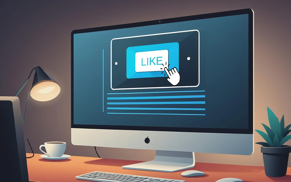
Ever noticed how the “like” button on Instagram somehow makes you tap it without thinking? Or how Netflix’s bold red “Play” button feels almost magnetic? That’s not magic, it’s design. Behind every clickable button lies a set of smart tricks that designers use to influence your click behavior. Welcome to the fascinating world of CTA design (Call-To-Action design), where psychology, color, and interactive design meet to create UI elements you simply can’t ignore.
At JD Institute, this kind of sharp design thinking is what students across Fashion, Interior, and Communication Design explore, because whether it’s a button, a garment, or a space, what gets people to “interact” is the ultimate design test.
A button isn’t just a rectangle with text, it’s the gateway to action. In UI terms, buttons are the bridges between user intention and digital outcomes. The smoother and more inviting the bridge, the higher the interaction.
Think of Amazon’s “Buy Now” button that is bright, bold, and perfectly positioned. A single click, and millions of transactions happen daily.

Similarly, fashion design plays with visual cues in the same way. Take the little black dress made iconic by Audrey Hepburn, its design was so inviting, it became the “button” that made women across the world adopt a timeless style. Design after all is, about guiding human behaviour.
Color psychology is no gimmick, it’s real science. Red means urgency (YouTube’s red play button dares you to act instantly), while green reassures (“Proceed to Checkout” on many shopping sites).

Interior designers use this same trick. Ever noticed how Pantone’s Color of the Year often becomes a must-have for furniture and decor? It’s because color doesn’t just decorate, it directs.
Students at JD Institute experiment with this by testing how a simple color change in a UI prototype can increase click rates, or how a shade in an interior space can set the emotional tone for the entire room.
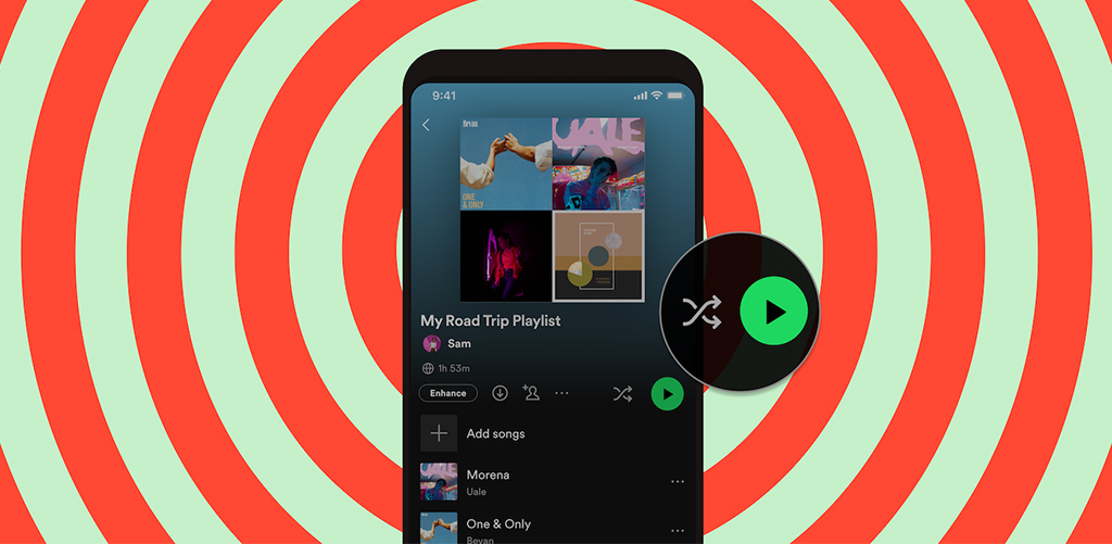
Big buttons get noticed, rounded corners feel friendlier, and motion draws attention. The subtle wiggle of a Spotify “Shuffle Play” button or the expanding “heart” on Twitter when you like a tweet? That’s interactive design doing its job.
Fashion has its equivalent: remember Lady Gaga’s meat dress at the MTV Awards? It wasn’t subtle, it was big, bold, and impossible to miss. The same rule applies to clickable design: make it visible, make it memorable.
This principle is something design students must experiment with when they create campaigns, testing how interactive ads and motion graphics influence user engagement.4
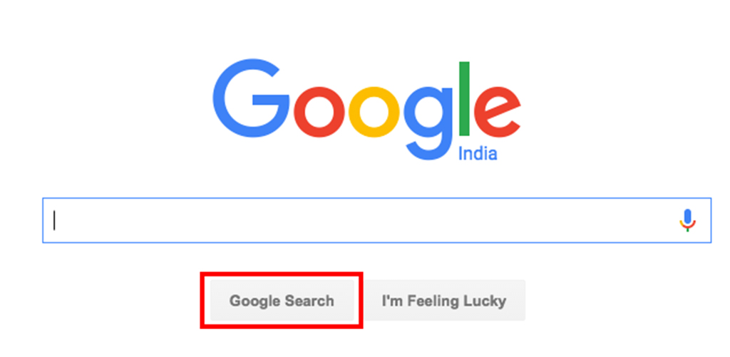
Even the best-designed button fails if placed poorly. Placement guides the user’s eye and action. Google’s clean search homepage is iconic because the “Google Search” button is right where your eyes land, front and center.
In interiors, this is like putting a statement chandelier right in the entryway. It sets the tone and directs attention. Placement, more than decoration, decides interaction.
Students must learn that in both digital and physical design, context shapes behavior, whether it’s a button on a screen or the flow of a room.
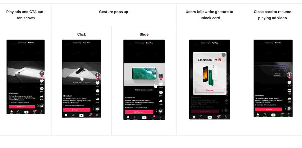
Today, buttons aren’t just rectangles, they’re voice commands, gestures, and even invisible zones. Think about how TikTok’s swipe-up gestures replaced buttons entirely but still drive massive engagement.
The next frontier of interactive design is about making the action so natural, you don’t even notice it. And that’s exactly what design education is preparing future creators for, because being ahead of the curve is the real trick.
At JD Institute, students aren’t just learning design, they’re learning how to create those moments of interaction that the world can’t resist clicking. Because in the end, whether online or offline, great design always gets a response.
So here’s your call-to-action: don’t just click- design the click.
Copyright © 2025 JD Institute of Fashion. All Right Reserved
Designed by


