
“Color is the keyboard, the eyes are the harmonies, the soul is the piano with many strings.” – Wassily Kandinsky.
Ever thought of how a simple shade of blue can either calm you or make you feel cold, depending on how it’s paired? That’s the magic of color harmony. Whether you’re painting a room, designing a logo, or styling an outfit, colors decide how people feel.
For anyone stepping into design, especially aspiring interior designers, mastering design color theory is like learning the ABCs of creativity. At JD Institute’s Interior Design course, this is one of the first things students get introduced to, because without color sense, design feels incomplete.
Think of Apple’s product designs. Sleek, clean, and often sticking to whites, silvers, or blacks. That’s the power of a monochrome scheme, using just one base color but exploring all its shades, tints, and tones.

Why it works:
Interior designers often use monochrome when they want a modern, chic look. For students, understanding monochrome helps you appreciate how “less is more” actually works. It teaches restraint and forces you to get creative with textures, shapes, and light.
Ever seen the Instagram logo? It’s a burst of pink, purple, and orange that just feels right. That’s analogous colors in action, three to four colors that sit next to each other on the color wheel.
Why it works:
In interiors, analogous colors can make a space cozy and inviting.
At JD Institute, students explore how analogous schemes can be used not just in interiors but also in branding and fashion styling. Knowing how colors interact makes you a smarter designer who can work across industries.
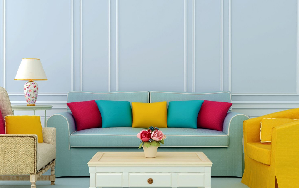
Think of FedEx’s logo, that is bold orange and purple. Or Pepsi’s iconic red and blue. That’s complementary colors, two shades that sit opposite each other on the color wheel. They create contrast that pops.

Why it works:
In interiors, designers often use complementary schemes in accents. For beginners, complementary colors teach confidence. They remind you that sometimes, the boldest risks create the best results.
At the end of the day, understanding Monochrome, Analogous, Complementary is like learning grammar before writing poetry. Once you know the basics, you can bend the rules, experiment, and build your own style.
Think of the timeless elegance of Chanel boutiques that often lean into a monochrome palette, or the cozy warmth of Starbucks interiors that rely on analogous earthy tones. Even bold hotel lobbies like W Hotels use complementary contrasts to make a statement. These aren’t just coincidences, they’re smart design moves powered by color theory.

If you’re serious about stepping into this world, learning Interior Design at JD Institute gives you both the theory and the playground to try it all out.
Copyright © 2025 JD Institute of Fashion. All Right Reserved
Designed by


