

We live on our phones, scrolling, shopping, watching, chatting, booking cabs, ordering food, everything. And guess what? Most users open websites or apps for the first time on their phones, not on desktops.
That’s why mobile-first design isn’t just a trend. It’s a must. If your design doesn’t work well on a small screen, chances are people won’t even stick around to see it on a big one.
So let’s talk about what really matters when you’re designing for mobile-first users. And yes, this is the kind of stuff design students at JD Institute learn through real projects, not just theory.
When people are on their phones, they’re in a hurry. They use one hand, usually a thumb, and expect things to be fast and easy.
That’s why apps like Instagram or WhatsApp are so easy to use, you don’t have to think. The buttons are right where your thumb lands. The layout feels natural.
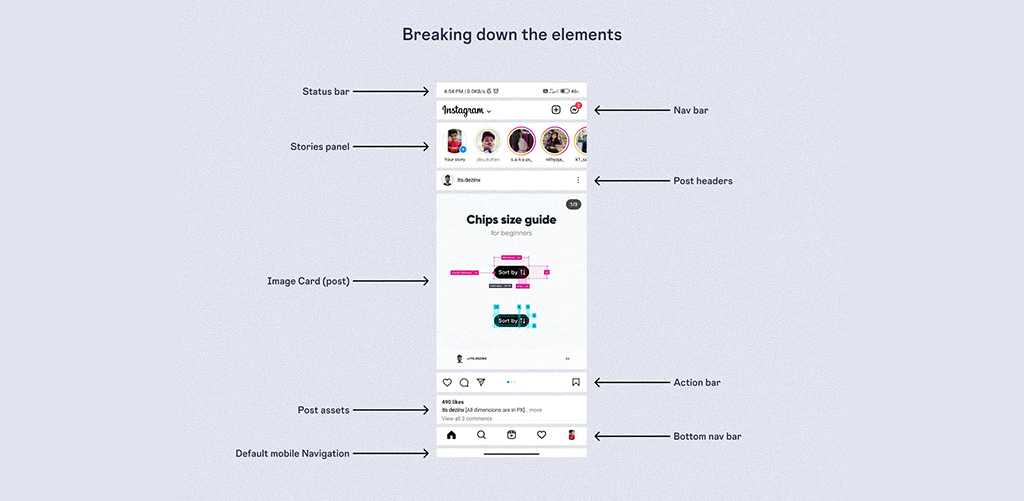
At JD Institute, students are trained to notice how people use mobile screens. They learn that good design isn’t about what looks fancy, but what actually works when people are scrolling in a crowded metro or lying on their beds.
Mobile screens are small. But that doesn’t mean you should squeeze everything in like you’re packing a suitcase.
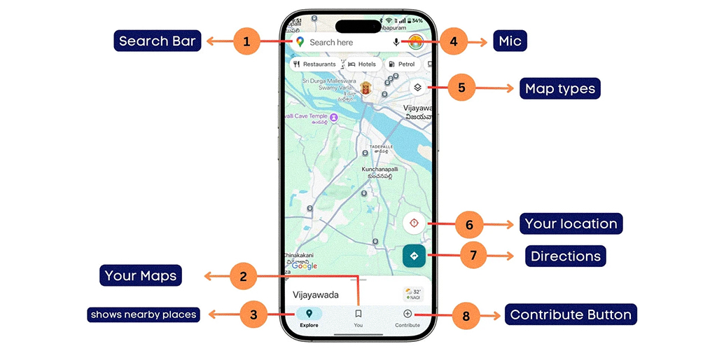
The trick is to prioritize. What do users need right now? For example, on the Google Maps app, the search bar and current location button are big and clear. Other stuff is hidden unless you need it.
The goal? Keep what’s useful, remove what’s not. That’s how you learn to design smart.
In mobile UI, speed is the new sexy. If your site takes more than 3 seconds to load, over half your users might vanish. Amazon reportedly loses $1.6 billion per year for every one-second delay in load time.
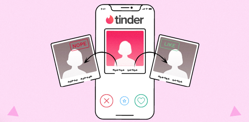
How do you design for speed? Compress images, use clean code, and avoid unnecessary animations. The Tinder app, for instance, uses simple gesture-based navigation and minimal UI for lightning-fast interaction.
Designers must learn that good design isn’t just about what’s visible, it’s also about what happens behind the scenes. Students are trained to use optimization tools and design for speed as a default, not a bonus.
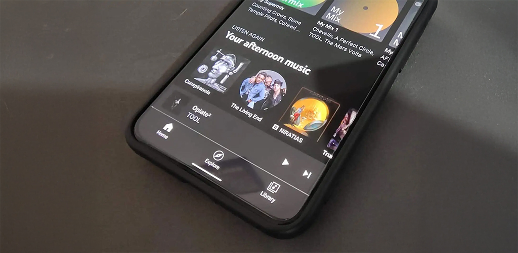
Here’s a fun fact: most people only use their thumbs to navigate their phones. That’s why apps like Netflix or YouTube place important buttons at the bottom, right where your thumb naturally goes.
If you design buttons at the top or make users stretch their fingers, they’ll get frustrated.
Good mobile design is thumb-friendly. So when designing, always ask that can I do this with one hand while holding coffee in the other?
Mobile is intimate. One screen, one user, one focus. So don’t overwhelm.
Uber’s interface shows you just one thing: “Where to?” And that single prompt guides the rest of the experience.
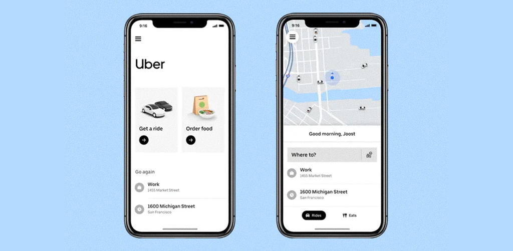
This design clarity is something every budding designer at JD Institute learns to master. Students are challenged to create UI that doesn’t shout but whispers with clarity. They’re taught to strip each screen down to its core purpose, helping real users make decisions, and not fight distractions.
In the end, designing for mobile-first users is about respecting their reality. Fast scrolls, tired thumbs, half attention, and still expecting magic. It’s where beauty meets utility, and JD Institute trains designers to live at that intersection. From understanding micro-interactions to prototyping for wearables, students are prepared to design in the realest, smallest, smartest spaces.
 Design Blogs
 Watch on youtube
 Downloads
Copyright © 2025 JD Institute of Fashion. All Right Reserved
Designed by


 Quick Menu