
In 2023, retail spending dipped in over 40 countries.
Global inflation, job losses, and rising living costs meant people were shopping less and thinking more before buying. But something strange happened — brands with smart visual strategies continued to attract footfall. Their secret weapon? Color psychology.
Welcome to the world of “Color Theory in Crisis” It’s not magic — it’s strategy. In tough times, when wallets are tight, colors do the talking. And if you’re dreaming of becoming a store designer or brand stylist, this is exactly what you need to know.
At JD Institute, the course of Visual Merchandising dive deep into the science of color and helps boost store experiences — especially when customers are cautious.
Color theory is not just about what looks good. It’s about understanding how different colors affect mood, emotion, and decision-making.
In retail, this becomes even more important during an economic slowdown. People buy less and think more. That’s where retail color strategy helps. It encourages positive emotions like trust, excitement, or calm — all of which can influence a purchase decision.
When money’s tight, shoppers become more cautious — they look for value and urgency. That’s why red rules the discount rack.
Startup Spotlight: H&M Sales Days
Especially during sale seasons or economic lulls, H&M heavily uses red in in-store signage, windows, and digital campaigns. It gives a “deal alert!” vibe, encouraging budget-conscious fashion shopping. These colors evoke urgency and FOMO (Fear of Missing Out). Red says “Act now!” and during sale seasons, that emotional nudge becomes a shopping sprint.
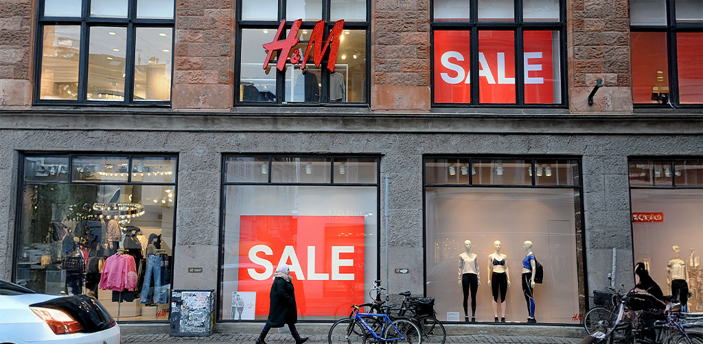
Why it works: Red stimulates quick decision-making. During a recession or economic slowdown, shoppers might hesitate — red pushes them forward.
Why it matters to students: In a Visual Merchandising course, students must learn how to style shelves, windows, and digital visuals using color psychology — because even the best-designed products need the right palette to get picked.
When wallets are wary, brands need to calm nerves. Blue, the color of calm and credibility, becomes a strategic choice for big players.
Startup Spotlight: Paytm
Look closely — FinTech brands that deal with your money? Most of them use shades of blue. In tough economic times, blue helps reassure customers: “You’re safe with us.”
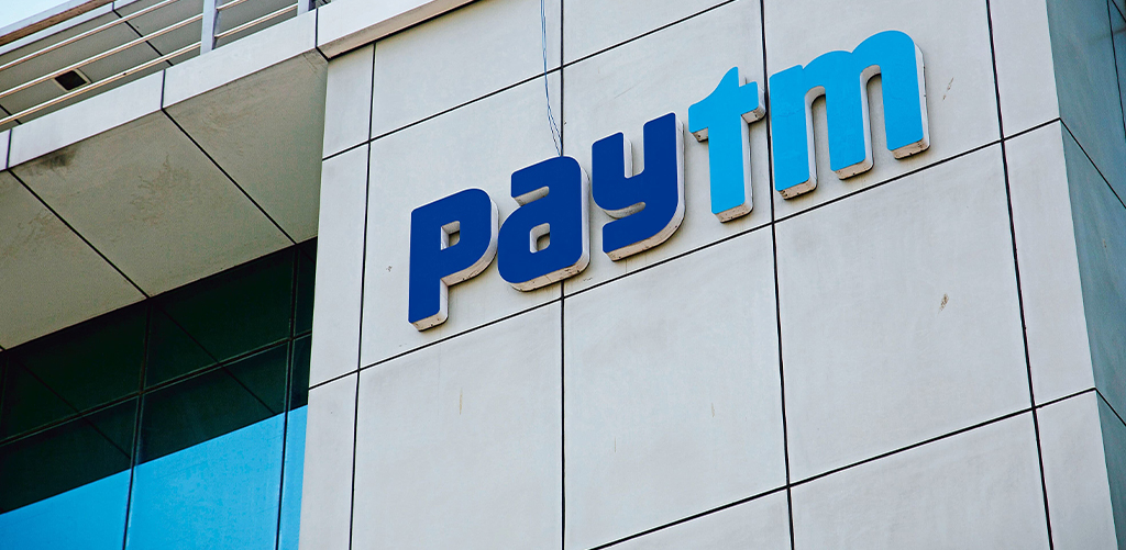
Retail translation: Stores selling big-ticket items like appliances or electronics lean on blue to encourage confidence in quality and purchase decisions.
Smart takeaway for visual merchandisers: If you’re designing a tech or luxury display, lean into blue hues to keep customers cool-headed — and clicking ‘buy.’
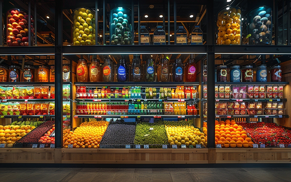
Green isn’t just for eco brands. During economic dips, it communicates balance, affordability, and wellness — all things shoppers crave.
Startup Spotlight: BigBasket
Online grocery platforms ramped up green visuals in their logos and packaging during inflationary spikes. Green equals “fresh,” “clean,” and “healthy” — especially when people are cooking at home more and watching spending.
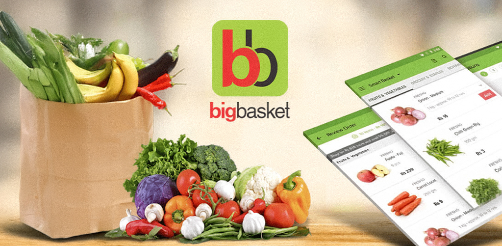
In-store strategy: From grocery stores to organic wellness counters, green reassures customers they’re making wise, health-conscious purchases.
JD Institute’s Visual Merchandising course, dive deep into how consumers “feel” colors before they “see” prices.
In hard times, luxury doesn’t disappear — it just gets subtle. Earthy tones like beige, taupe, and ivory signal quiet elegance and timelessness.
Startup Spotlight: Minimalist
These brands didn’t go loud during downturns. They embraced minimalist, muted tones to suggest refined taste, not show-off splurging. Neutrals say, “This isn’t a trend — it’s an investment.”
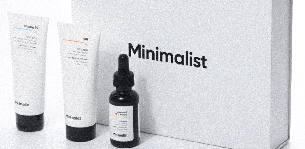
Retail strategy: High-end boutiques or sustainable brands use neutral palettes to attract mindful, quality-focused buyers.
Visual Merchandising tip: Use neutrals as a background to make premium items pop without overwhelming the eye. Especially useful for window displays and lifestyle setups.
Bright tones like pink and white bring energy, cheer, and optimism — a perfect antidote when the economy feels gloomy.
Startup Spotlight: Nykaa’s Hot Pink Sales
Nykaa introduced lower-priced lines with their Hot Pink Sales with pink and white branding. The message? “You can still treat yourself — on a budget.”
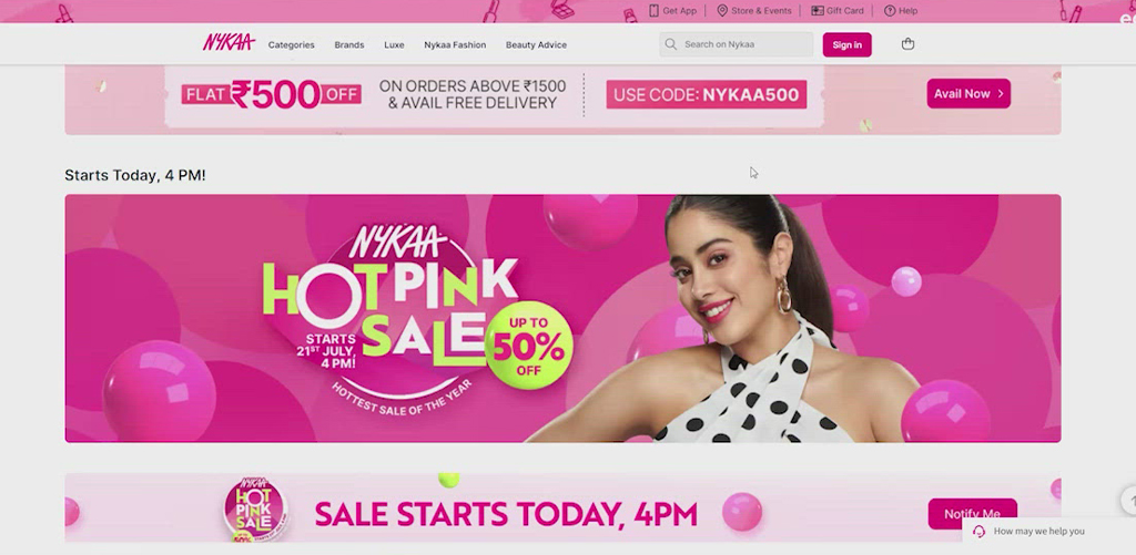
Retail color strategy: Use these hues in budget sections or seasonal corners to attract light-hearted buying even in uncertain times.
For future stylists: Matching moods with color? That’s an art JD Institute teaches — because understanding what triggers buyers emotionally is key in today’s experience-driven economy.
In the age of “scroll, shop, repeat,” the designers who’ll win aren’t just creative — they’re strategic. They know how to make visual magic that moves products, even when people are saving instead of spending. That’s why enrolling in JD Institute’s Visual Merchandising course isn’t just about aesthetics — it’s about becoming a retail psychologist with a killer color palette.
Copyright © 2025 JD Institute of Fashion. All Right Reserved
Designed by


