
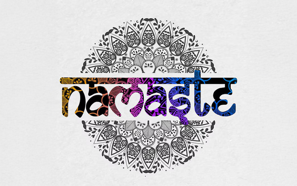
Ever tried reading a shop name and suddenly felt like you were decoding a temple wall inscription?
That moment when you pause, squint at the swirly script, and realize — it’s Hindi, but make it fashion. Welcome to the new wave of vernacular design, where Indian calligraphy isn’t just a thing of old manuscripts, but a powerful style statement in the world of modern visual merchandising.
So why should an aspiring visual merchandiser care about this? Because cultural relevance isn’t just cool — it’s converting. Smart brands are blending retail heritage with sleek design to create storefronts that don’t just attract eyeballs but stop people in their tracks.
And guess what? If this is the kind of future-forward creativity that excites you, the Visual Merchandising course at JD Institute will hand you the exact tools to master it — blending art, culture, and commerce.
We’re not just talking about pretty fonts. We’re talking about identity, belonging, and bold branding. Using Indian scripts like Devanagari, Gurmukhi, or Tamil in retail signage sends out a strong message — “We’re proud of where we come from.”
Case in Point: Bombay Shirt Company
This Mumbai-based label has played with Indian aesthetics in its pop-ups and visual styling. You’ll often see minimalist displays with hints of regional calligraphy, giving it that warm, rooted feel. It doesn’t scream — it sings.
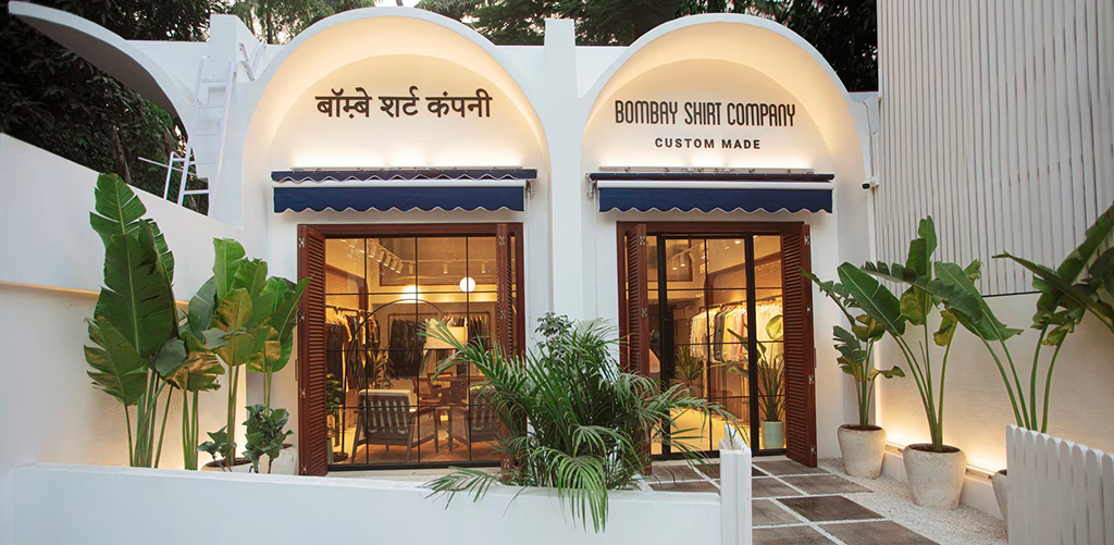
Blending cultural branding with clean design makes the brand more approachable and emotionally connected with local customers. It’s not just a shirt shop; it’s a place that gets you.
Indian calligraphy isn’t just decorative — it’s deeply expressive. Each curve tells a story. That’s why using these styles in visual merchandising adds depth and drama. It brings emotion, nostalgia, and a serious wow factor.
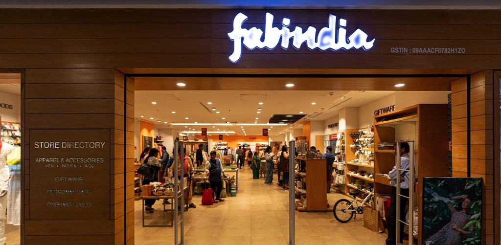
Case in Point: Fabindia
Their stores are a masterclass in mixing the traditional with the contemporary. From signage to packaging, they frequently use Indic scripts to highlight their roots. The result? A visual language that feels authentic, yet aspirational.
As a student in visual merchandising, you learn to see more than just fonts. You start to notice feelings in forms, how a swish of a letter can whisper “premium” or how a handcrafted script can scream “authentic”. The JD Institute’s Visual Merchandising course digs deep into this — not just in theory, but in hands-on projects that bring these ideas to life.
Here’s the cool part — this isn’t about going retro. It’s about remixing the old into something bold. Think of it like sampling a classical song in a hip-hop track — familiar, but fresh.
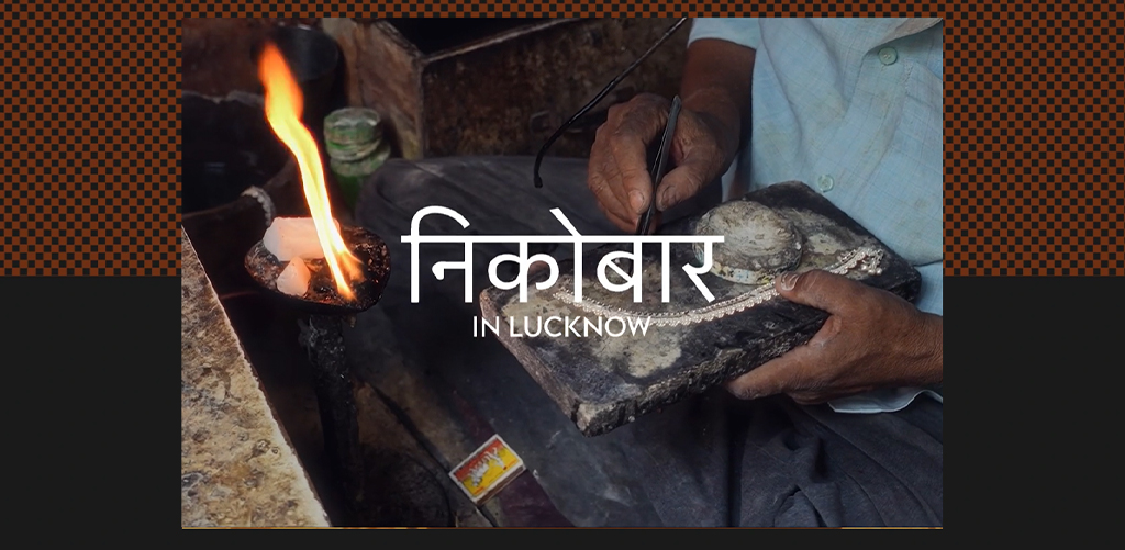
Case in Point: Nicobar
This lifestyle brand has nailed the art of the understated Indian aesthetic. Their store visuals often use muted palettes, paired with Hindi and Sanskrit lettering in modern settings. It says “heritage,” but it also says “chic AF”.
This is the kind of innovation that sets a brand apart in a saturated market. And if you’re wondering, yes — aspiring visual merchandisers absolutely need to care. Because in today’s retail, it’s not just about being seen. It’s about being felt.
You know a brand’s visual merchandising is strong when their stores feel like a storybook — and that’s exactly what Good Earth pulls off. This home and lifestyle brand uses subtle hints of Urdu calligraphy, Mughal-inspired artwork, and old-world typography to give their storefronts a regal, yet relatable energy.
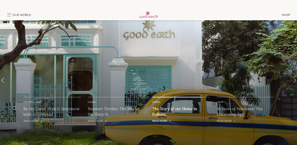
Their use of vernacular design is soft, poetic, and layered with meaning. Instead of shouting “buy me,” their visuals whisper elegance, legacy, and pride. It’s a masterclass in how retail heritage can add perceived value and timeless charm.
Chumbak takes the colorful route. Known for its playful, quirky take on Indian culture, the brand often uses bold Devanagari typography, street-style visuals, and local idioms right in its store signage and product displays.
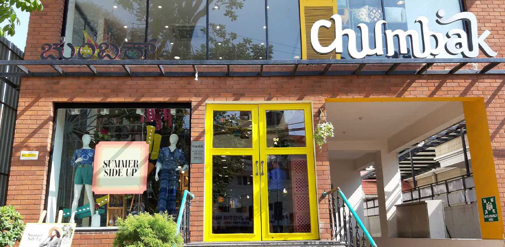
Their approach proves that you don’t have to be “serious” to be rooted in culture. You can be fun and funky and still pay homage to India’s typographic richness. For aspiring merchandisers, this is a reminder: Indian calligraphy isn’t just traditional — it’s versatile. It can be cool, contemporary, even cheeky.
Let’s get real. Anyone can put products on a shelf. But turning a storefront into a cultural moment? That’s strategy. That’s the style. And that’s what modern visual merchandising is all about.
And where do you learn how to do all that with confidence? You already know the answer — JD Institute’s Visual Merchandising program, where cultural insight meets cutting-edge design skills.
Copyright © 2025 JD Institute of Fashion. All Right Reserved
Designed by


