
“What made you click that video?”
Was it the title? Maybe. But chances are—it was the thumbnail. That one small image, packed with colors, faces, text, or emotion, made you stop scrolling and click.
Whether it’s Netflix, YouTube, Spotify, or even Instagram, thumbnails and banners rule the digital world. And if you’re a communication designer or planning to be one, you need to understand how these tiny visuals are actually smart design strategies that move millions—and even make billions.
Let’s break it down.
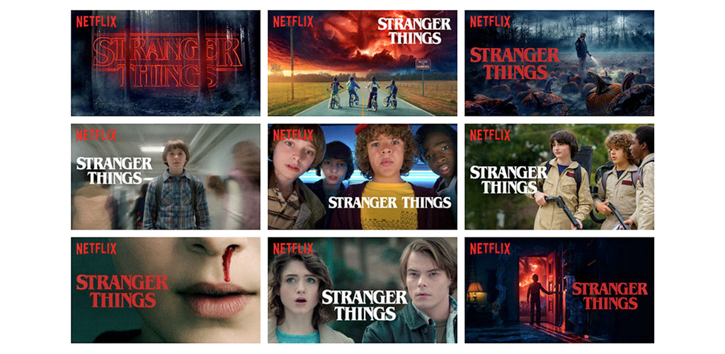
Netflix doesn’t randomly pick a poster for each show. In fact, they test different thumbnails to see what works best. Stranger Things alone had many versions—some showing Eleven, others focusing on the group, depending on who’s watching.
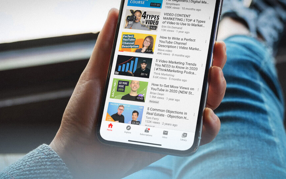
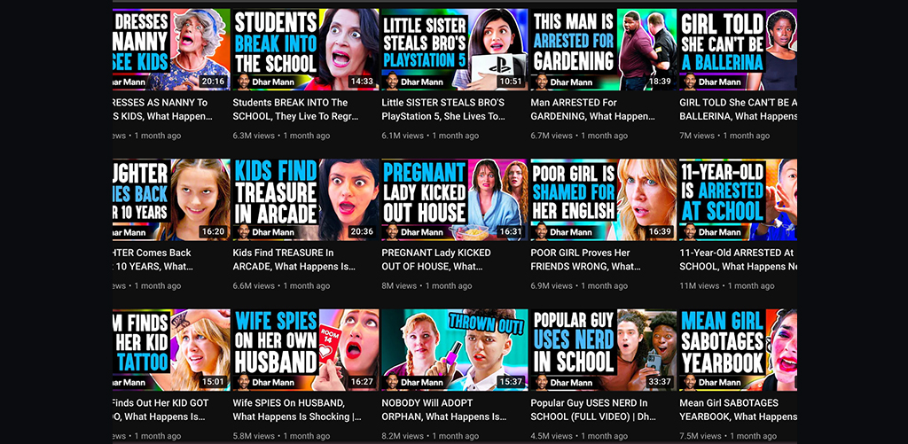
The same happens on YouTube. Creators like MrBeast test dozens of versions to find the one that gets the most clicks.
It’s not luck. It’s smart communication design at work—knowing what makes people stop and say, “Okay, I’ll watch this.”
Ever noticed that most thumbnails have faces? Big, close-up faces showing emotion?
That’s because we’re wired to notice faces first. Netflix shows like The Queen’s Gambit use intense expressions to draw you in. On Amazon Prime, Fleabag or Mirzapur posters always focus on the main character’s emotion.
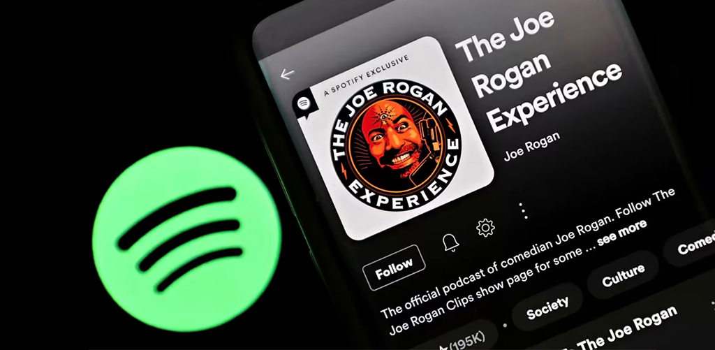
Even on Spotify, popular podcasts like Call Her Daddy and The Joe Rogan Experience use facial expressions in their tile design.
If you’re designing something that’s meant to grab attention fast—start with a face. It creates instant connection.
On YouTube, you’ll often see words like “SHOCKING,” “HOW I DID IT,” or “$100,000 CHALLENGE” splashed across thumbnails. That’s because words give context—and urgency.
But Netflix and Amazon Prime don’t use words at all. Why? Because they focus more on strong visuals that match the mood.
Instagram Reels? They go both ways. Some reels have bold text overlays like “WAIT FOR IT…” or “DON’T MISS THIS.” Others are purely visual.
The smart takeaway? It depends on where you’re designing. And knowing when to use text—and when to skip it—is something students learn practically in the Communication Design course at JD Institute.
Red grabs attention. Blue feels calm. Yellow looks cheerful.
YouTubers like Dhar Mann or T-Series use bright, bold colors that pop out of the screen. On Spotify, shows like Crime Junkie use black backgrounds with red fonts to build mystery.
Netflix? They go moody—deep blues, shadows, or even black-and-white for serious content like Narcos or The Crown.
When you’re a communication designer, you don’t just pick a color because it “looks nice.” You choose it because it tells a story.
Did you know A/B tests are done for thumbnails? They show different versions of a poster to different people and track which one works better.
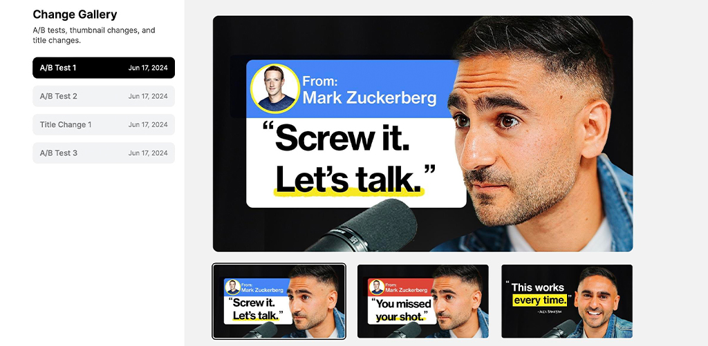
YouTubers often change thumbnails later if the video isn’t getting enough views. They watch the data and make changes.
Spotify also updates tile designs based on which ones people are clicking more.
This is a big tip for future designers: Good design needs testing, not guessing. That’s what makes the Communication Design program at JD Institute special—it trains you to think both creatively and strategically.
Whether you’re creating for social media, video platforms, or podcasts, remember:
Thumbnails and covers are not decorations. They’re conversations. They say:
“Look here.”
“Watch me.”
“Trust this.”
“Click now.”
And if you’re dreaming of a future in design—where your ideas don’t just look good but work well—then learning how to build such smart visuals is essential.
Next time you scroll past a YouTube video, a Netflix series, or an Instagram Reel—pause for a second.
Ask yourself, Why did this one catch my eye?
That’s your first step into the mind of a communication designer.
\And if you want to dive deeper, the Communication Design course at JD Institute helps you turn that curiosity into a career—where you don’t just admire good design, you create it.
Copyright © 2025 JD Institute of Fashion. All Right Reserved
Designed by


